From the Editor: How Making a Magazine Is Like the Tour de France

At Portland Monthly, we construct our Design Annual over the summer months. So it was that my editorial sensibilities for this special issue filtered through many early mornings spent watching the Tour de France, that cryptic but beautiful festival of speed, suffering, and castle-dotted vistas that percolates in some obscure corner of American sports cable every July.
The Tour has fascinated me for a long time. I don’t really get it, exactly, but it’s awesome. Cycling’s wizened, Continental combination of sporting chivalry and fatalistic cynicism makes an appealing contrast to square-jawed jock culture américain. (Drugs? When I see a rider descending some Alps precipice at more than 60 miles per hour, I sort of hope he’s on drugs.) This year, tuning in to France felt like a symbolic opportunity to make the planet great again. And it was a cool edition, 2017: spicy with aggro and shoves, a badass King of the Mountains (Warren Barguil), and a maniacal downhill breakaway by a Slovenian who used to be a ski jumper, which I guess helped.
But with this issue ever in mind, the Tour impressed me as a design achievement. Look at it that way, and it hints at the beats we cover: industrial design (the bikes), graphic design (the millions of ads), organizational design (the event, the torturous course), urban design (a time trial on Marseille’s twisty streets), homes (castles), and fashion. Re: the latter—the old stuff is better. I lost a YouTube hour to A Sunday in Hell, a 1976 cycling documentary featuring sharp kits, rad warm-up jackets, and Belgian legend Eddy “The Cannibal” Merckx skulking around in shades and a loose pompadour. Le temps perdu, non?
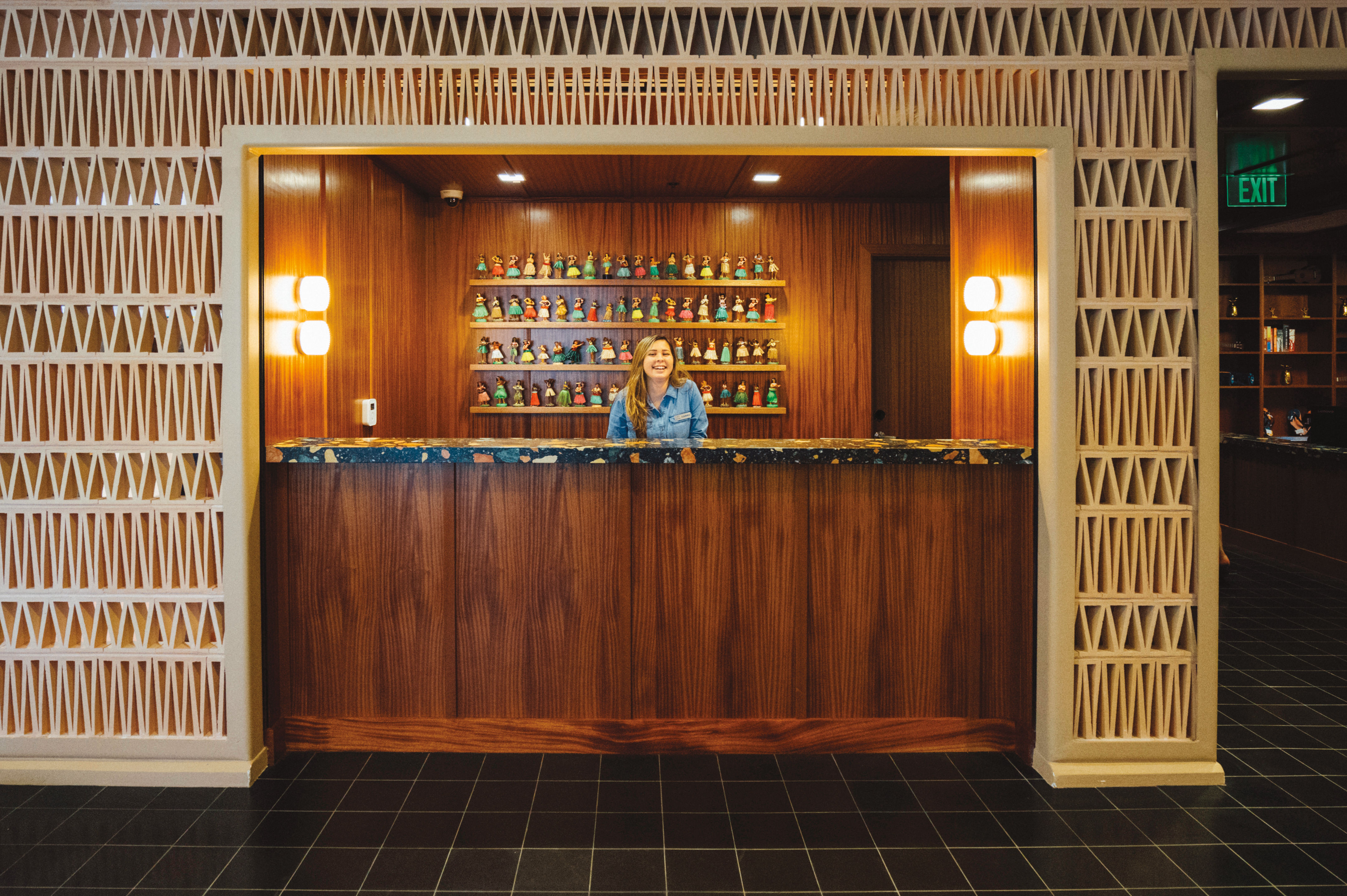
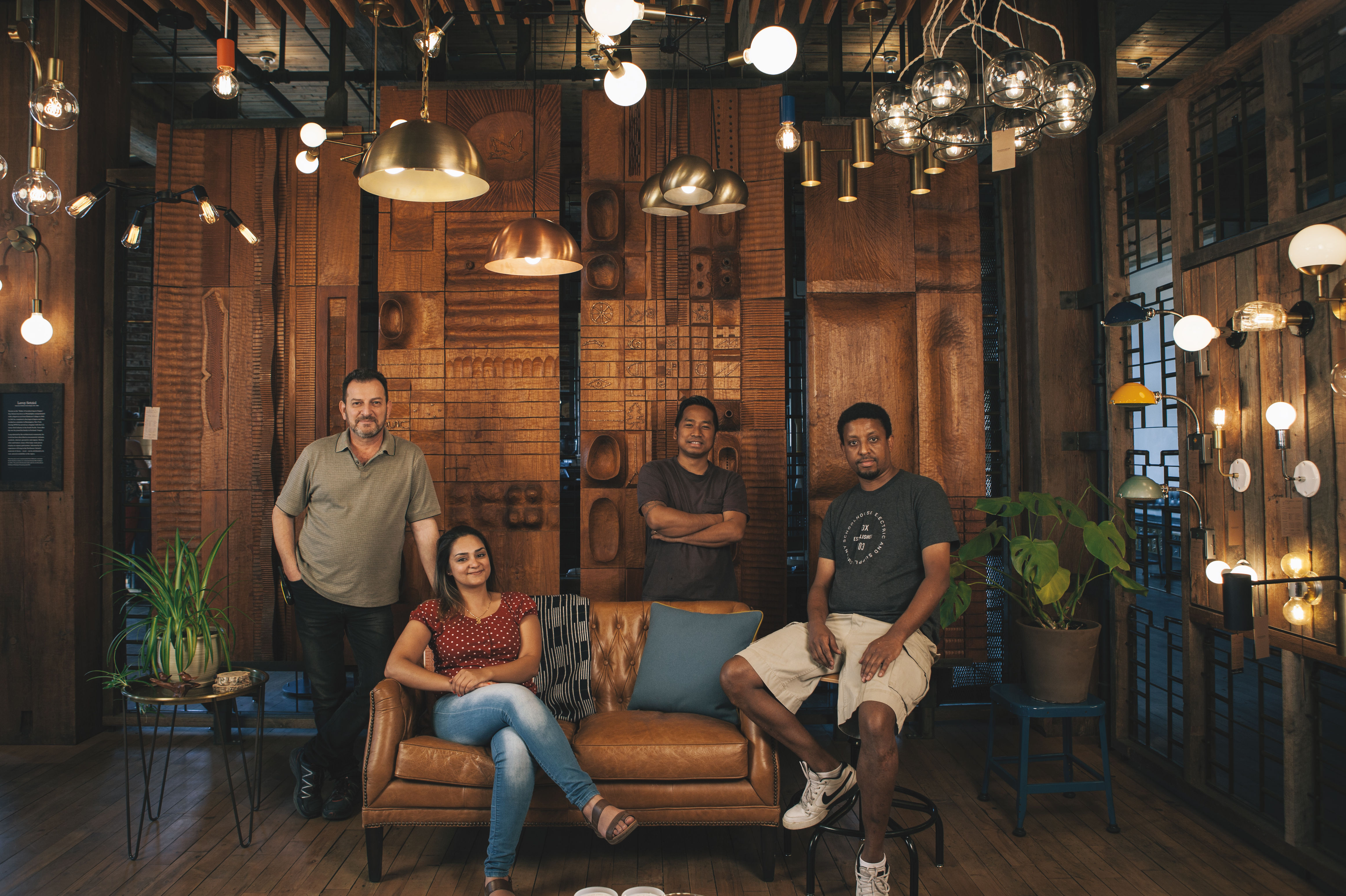
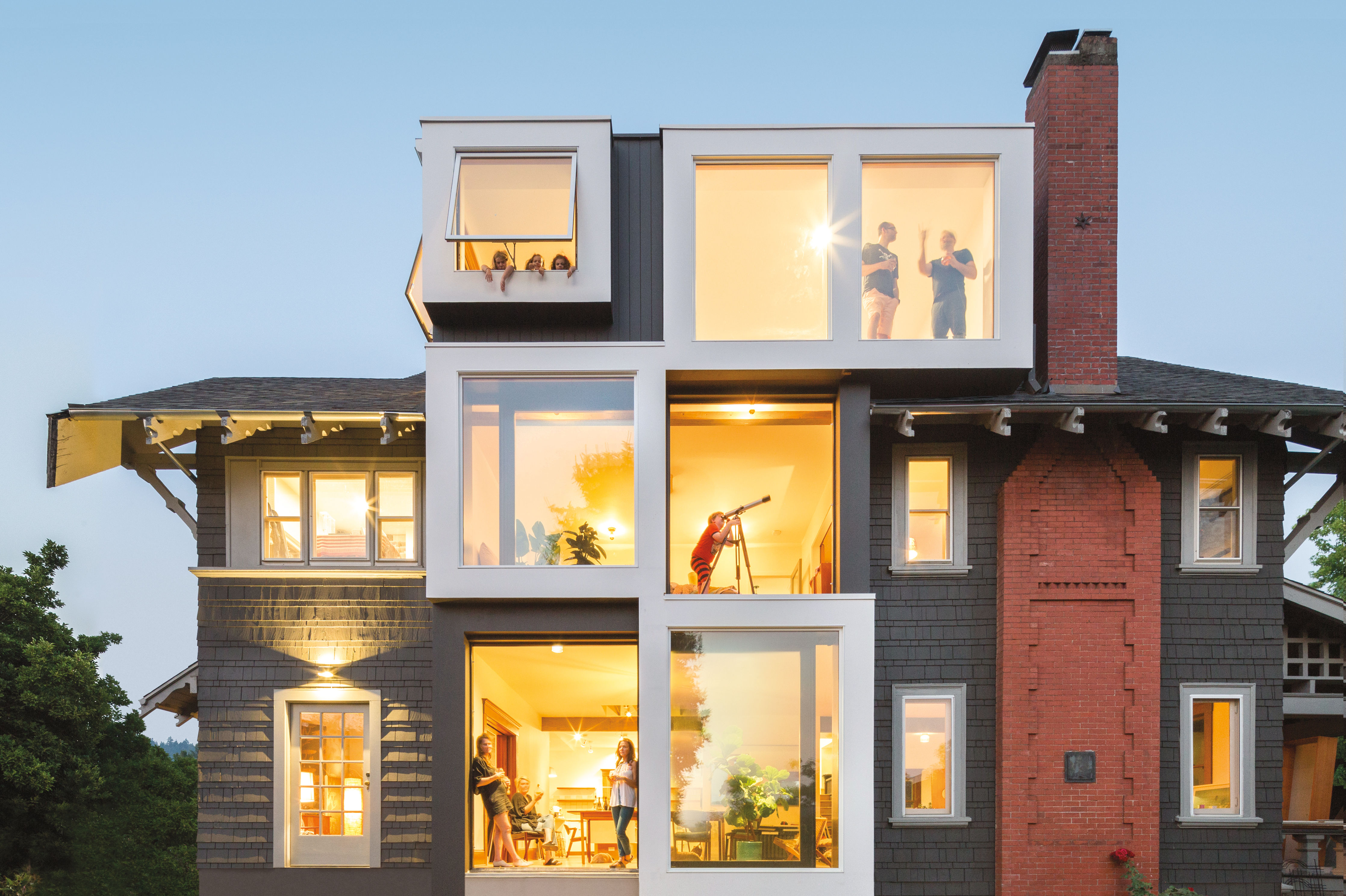
That sport is all about the team—only the right collective can produce individual greatness. Same goes for almost every project in the magazine that follows. The branding and design firm OMFGCo recounted how various specialists came together to craft a dreamy Hawaiian hotel. The Tokyo clothing titan Uniqlo looked all the way to Portland for the key collaborators on its new HQ. Schoolhouse Electric, the local home goods brand, relies on a factory staff without borders. Beebe Skidmore, the firm responsible for the house on our cover, fuses two distinct talents into one practice on the rise.
And, of course, the Tour demands that all its riders hit it as hard as they can. In that respect, it resonated: Design Annual wouldn’t exist without a squad of writers and artists leaving it all on the course. Special commendation goes to designers Mike Novak and Jen Wick. There’s no special prize money for this one. But can I interest you in an aperitif?
Zach Dundas
Editor in Chief


