Portland Palettes
Any interior designer will tell you: Paint is hands-down the easiest, cheapest and most dramatic decorating tool you can use to change your surroundings. But as anyone who’s stood before a paint-store display, eyes squinting at the relative merits of “Sea Foam” versus “Dove,” can attest, choosing a color can be a headache-inducing endeavor.
Being on the mistier end of the 45th parallel doesn’t help. Here in Portland, we’re surrounded by soft, muted skies, lush greens and other natural colors year-round. So we definitely have our work cut out for us when trying to warm up our homes.
Choose a Hue
Although it may seem smart to paint a room with bright, loud colors to challenge the dreariness outside, local designers suggest a better strategy might be to use a muted color in a warm tone. The key is contrast, but not stark contrast. Gretchen Schauffler, founder of Portland-based Devine Color, for instance, recommends keeping three factors in mind when choosing paint in our climate: first, the amount of light you have to work with—consider all the light (sunlight, artificial light and reflective light); second, the temperature of the color—will warm (red, yellow, and orange) or cool colors (green, purple, and blue) work better for your view?; and finally, the color of the wood in your home. Your wall colors should come alive against the natural tones in wood.
“With our climate, we’re looking for more of a harmonious feel,” says Janie Lowe, cofounder of Portland-based paint producer Yolo Colorhouse. “In hotter climates, bright, hot colors really work. But here we need a sense of serenity and harmony with nature.”
Cool colors can make a room feel colder and, thus, work better in a climate (or simply a room) with a lot of sun exposure. Warm colors warm up rooms and can be a natural choice for our environment. Some interior designers and colorists will say that cooler colors are better for bedrooms because they are serene, while warmer colors are best held for more active spots like dining rooms and kitchens. Also key: Dark colors advance, making a room feel cozy (read: smaller), while light colors recede, making a room feel more open.
Henry Brown of Portland’s Henry Brown Interiors believes that if your personality calls out for more intensity, you could go for a muted version of a red, not bright lipstick red. “You can’t do saturated colors here unless it’s in small amounts,” Brown advises. “Otherwise it seems too heavy-handed.” This also applies with yellows. Use those on the earthier side and save the lemony ones for accents.
If you’re a fan of cool colors but still want a cozy room, don’t be afraid to try warmer colors on the cool palette. Some blues for example have more red undertones, which warm them up compared to blues that have more yellow in their mix. In fact, Yolo Colorhouse reports that these warm blues and greens (specifically Water .02 and .06, and Leaf .04 and .05) are some of their best-selling products.
However, once you’ve picked your color, you’ll need to consider your space as a whole before committing. Observe color relationships: how the color mixes with your furniture, artwork, woodwork and other hard surfaces. Then watch as the complexities of paint hues subtly change depending on the light of day.
{page break}
Consider the Light
One of the biggest issues to consider in Portland is the sun—both its direction and its tendency to hide out. Brown points out that people neglect to think about light exposure. “Color on walls that face south will be different than on those that face north or east,” he says. “Northeast exposure is a cool, gray light; southwest is a very warm light.”

Reflected light—the light from outside that bounces in—can also significantly modify how color looks on your walls. Remember, color is entirely relational. So, if you live in a home surrounded by garden that stays green all year, the light that is reflected onto your walls will have a green hue, changing the way your eye perceives color. And if you live in a Pearl District loft on an upper floor, the cloudy skies will make any blue you use seem even chillier.
Raising the White Flag
For many interior designers, fretting about walls is silly. It’s what’s on them that counts. Paint should be neutral. Consider that Devine Color’s top-selling shades are Devine Mocha, Paprika and Peanut, all versions of warm neutrals. Benjamin Moore’s best-sellers in our region include a range of linen, white, beige and bisque colors. As an interior designer, Brown feels that walls work best as a backdrop for the color you choose in accessories, upholstery and other, smaller accents.
But not all neutrals are created equal, according to expressionist landscape painter Robert Gamblin, founder of one of the world’s top artists’ paint companies, Portland-based Gamblin Artists Colors. He argues that stark whites are a big mistake because the “wall is in competition with virtually any piece of art.”
Instead Gamblin suggests using a warm neutral color throughout, or painting each room specifically for your art pieces, which, he admits, may conflict with how to paint for our climate. “You have to choose what horse you’re going to ride,” he says, paint for the art or paint for the view.
If the artwork wins out, he suggests going even further by changing your pieces with the season. “The Chinese have long used paintings as forms of air-conditioning,” Gamblin says. Art can change the temperature of a room, at least metaphorically speaking. “I have a nice little painting that’s about two feet square, and about 80 percent of its surface is really hot red. It radiates warmth into the space like a fireplace.”
{page break}
Pick Your Palette
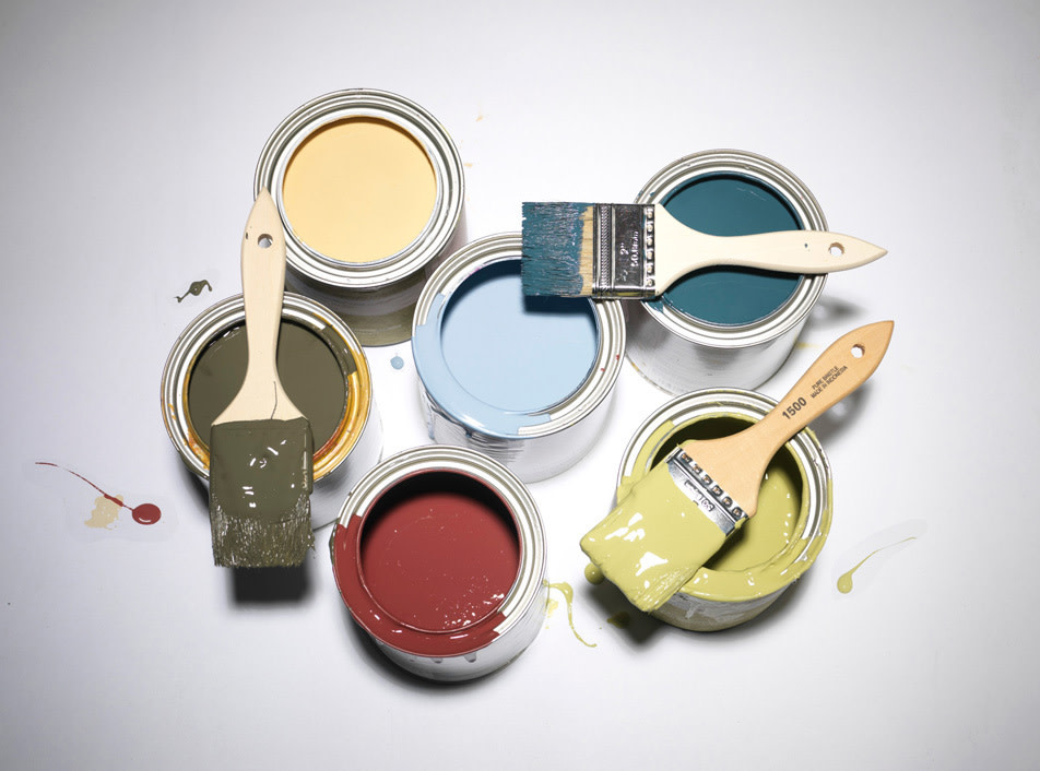
Still daunted? The best way to learn—and to avoid stacking the “oops” cans in the garage—is to experiment more boldly. Get over the idea that you can choose a color from a one- by two-inch paint strip. Buy a quart and try a patch, or choose a paint brand with larger samples. Yolo Colorhouse sells poster-size painted swatches of their colors for $6, complete with repositionable tape. Devine Color (sold at area Miller Paint locations) offers Mini Paint Pouches, which will cover four square feet, for $3.99.
Remember to border your poster swatch with white tape or primer to see exactly what it will look like when it is not against your old wall paint.
Overall, though, don’t stress. Paint isn’t permanent. The sky color will eventually change; spring and summer will come. You could, however, mix up your palette with the change of seasons if you’re so inclined. After all, it’s only paint.
Local Heroes
Lucky for us, a few local companies have developed paint lines suitable to Portland’s palette.
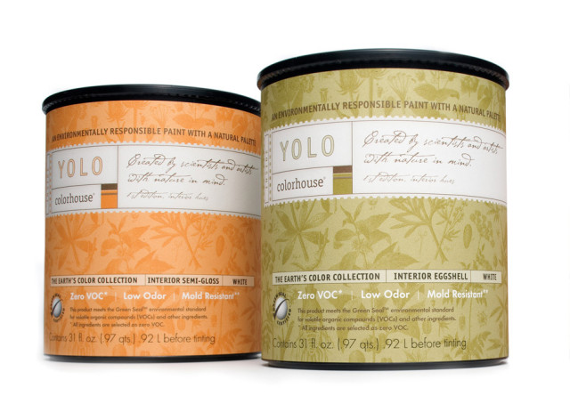
Yolo Colorhouse (yolocolorhouse.com) paints are based off natural shades. They’re rich colors, but not too bright. For our region, cofounder Janie Lowe recommends Yolo’s Grain .05 on the walls and Air .04 on the ceiling, a combination that gives the illusion of a sun-drenched room. If you want to create the impression of greenery reflecting in from outside, replace Air. 04 with Air .05, which is off-white with a touch of green. $40 for one gallon, available at various locations.
After moving from Puerto Rico and desperately craving color, Gretchen Schauffler created Devine Color (devinecolor.com) specifically for the Pacific Northwest’s climate and light. Her line of 11 palettes and 128 colors is meant to make interiors warm, but not dark, and help to counteract Portland’s muted tones. $39 for one gallon, available at Miller Paint.
Benjamin Moore (kaleidoscopepaint.com) has also developed a Pacific Northwest-specific paint collection. The hues draw inspiration from our landscape itself, with shades encompassing earthy, saturated blues, plums, greens and browns. Ask for the Pacific Northwest Color Collectives pamphlet at Benjamin Moore retailers. $36–$48 for one gallon, available at Kaleidoscope Paint.
To help both Mother Nature and your decorating sense, pick out a few of Portland MetroPaint’s (metro-region.org/paint) 100 percent recycled latex paints. Since the 15 available colors are created by mixing together leftover colors, they’re naturally muted and therefore work well in Portland’s interiors. But be careful your chosen palette doesn’t become drab. $5–$9 for one gallon.