Picture Puzzle
The row of pictures on a white wall, carefully hung and evenly spaced like boxcars on a train, is a fairly recent gift to our interiors from the modern American art market. For two centuries or more, art was more often enjoyed salon-style, with big and small pieces mixed together and displayed from floor to ceiling. In European museums, art often is still shown this way.
The term “salon-style” derives from the famed Parisian art school École des Beaux-Arts, which, in the mid-17th century, began to exhibit the paintings of graduating students in huge public shows. Soon French royalty followed suit, offering public exhibits of its favored artists. Often infused with everything from controversy to kitsch, these royal salons were an early French version of American Idol; just substitute Edouard Manet’s Olympia for Fantasia Barrino’s cover of “Summertime.”
The era’s artistry, of course, is now mostly relegated to the Louvre, but the style of hanging pictures is again fashionable in galleries, museums, and especially homes. There are really no rules; all it takes is a good eye—or more to the point, confidence in your eye. So who better to look to for guidance than one of Portland’s most self-assured purveyors of style: Bruce Carey, the restaurateur behind 23Hoyt, Saucebox, Bluehour, and Clarklewis.
A longtime art enthusiast, Carey displays his collection—and those of his friends—on the walls of 23Hoyt, salon-style. “Part of our goal is to separate ourselves from the corporate monster and to infuse the space with personality, even if it’s quirky or odd,” Carey says. “Restaurants are about relationships. Most of the artists represented here are friends. The way we approach the menus is chef-driven and personality-driven. It makes sense to also have a personality-driven interior.” Carey’s eccentric galleries rotate about once a year to make room for new pieces and freshen the ambiance. Here’s a quick primer on how he creates his modern-day salon.
{page break}
Select the Mix
To choose the artwork to display at 23Hoyt, Carey enlisted close friends Jane Beebe (owner and director of PDX Contemporary Art); Pink Martini member Thomas Lauderdale; and Lauderdale’s partner, designer Philip Iosca. The group then culled their favorite pieces from their personal collections—works made by national, local, and anonymous artists alike (including Storm Tharp, Jock Sturges, and Patrick Abbey), plus vintage pieces found at thrift stores.
Choosing which works to hang from this collaborative collection was an organic process. “It’s about pulling together parts of your intuition,” Carey says. In the end, the group opted to mix mediums, styles, dimensionality, and even some humor on the walls. A giant wood spiral—part of an antique printing press—from Carey’s personal collection, for instance, protrudes from the wall beside a black-and-white photograph by Jock Sturges. Six vintage plates are suspended between local artists’ work: A brightly colored print by Adam Sorensen and a red linoleum sculpture by Erin Long. “Depth was also a consideration,” Carey says. “We wanted variation on the wall: Some [pieces] are more sculptural, so we wanted balance in the mix.”
Carey says his collection is split 50-50 between fine art and vintage and found objects. And if you’re afraid your original fine artwork won’t shine brightly enough when it’s displayed beside other, less-refined pieces, he assures you not to fret. “The artist might feel that when their work is placed next to Grandma’s needlepoint, you’re making fun of it,” Carey says. “But I don’t think you’re taking away the importance of a piece by accompanying it with something you find charming. They are of similar value to you.”
Map the Arrangement
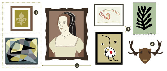
1. THINK VERTICALLY
Think of each vertical column of art as a unit and center each piece within the column as you fancy.
2. CREATE A BUFFER ZONE
Allow the more important, larger, or darker pieces in your collection to breathe by leaving more visual negative space around them.
3. DIVERSIFY YOUR FRAMES
A benefit of the salon style is that it works to unify eclectic frames and works of art by proximity.
4. EMBRACE DIMENSION
Don’t neglect your much beloved sculptural and dimensional works—they can add interest to a wall of art in surprising ways.
{page break}
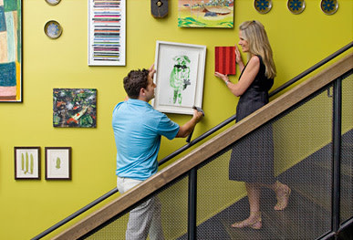
Now that you’ve chosen which pieces to include in your salon-style collage, it can be overwhelming to figure out how to get them all on the wall. The best strategy is to measure your wall, use a string to outline a space on the floor with the same area, and start laying out your pieces there. First place the pieces that resonate most with you, and then take the plunge and start filling in the gaps with the rest. Carey and his pals started with two black-and-white Jock Sturges photographs. “It’s like arranging furniture,” Carey says. “You know you want the couch to face the fireplace, so you put that there; then you put the other pieces around it.”
Although Carey’s galleries are a mélange of mediums, you could certainly create a salon that cleaves to a single theme—say, black-and-white photographs, or works from a certain period, or sculpture only. The key is to keep moving things around until the composition feels right. Once it sits well with you, sleep on it and revisit the arrangement the next day with fresh eyes before hanging it on the wall.
Hang Time
There are three tools you’ll need to ensure proper and level hanging: A level, a pencil, and a tape measure (see “Tricks of the Trade” on the next page for tips). Carey eyeballed the negative space between each piece of art at 23Hoyt, deciding it didn’t need to be uniform—but if it’s important to you that the gaps between pieces are equal, be sure to measure carefully on the floor before you start putting holes in the wall. Remember that negative space can be as powerful as positive space. “It may seem like all the pieces are thrown up there, but the challenge is to make it a composition of parts,” Carey says.
Most of all, rest assured that there are no huge mistakes to be made with salon-style hanging, unless a piece is hung remarkably crooked. Don’t be afraid to switch out pieces and re-arrange things as the composition grows on you. A wall of art should be a living, breathing thing. And even a master of stylistic confidence like Carey sees pieces on 23Hoyt’s wall that he’d like to tweak. “Just try to create a mix and work in a balanced way,” he says. “Really, you only know if it’s a mistake once you see it on the wall.”
{page break}
Tricks of the trade
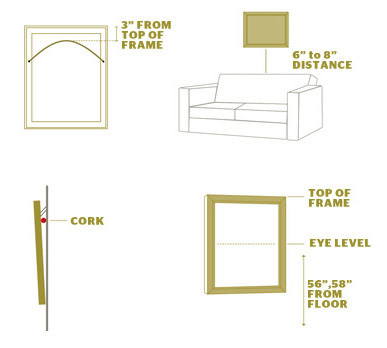
Mind the Drop
Ensure that your wire can bear the weight of your picture or decoration. At full tension, your wire should measure 3 inches from the top of the frame.
Sit Pretty
Guests will be uncomfortable if they’re worried about bumping their heads or knocking artwork off the wall. Keep the bottom edge of frames 6 to 8 inches above couches or chair backs.
Avoid Glare
Museum-quality glass will protect and preserve your artwork while reducing glare. If you can’t make the splurge, place a piece of cork between the top of the frame and the wall to cut glare.
Meet the Eye
The most basic rule of hanging artwork is to place the center of the piece at eye level for someone standing in the middle of the room. This will be roughly 56 to 58 inches from the floor.
Although salon style is all about capturing a certain je ne sais quoi, there are some hanging tricks that will help you on your way. Adam Sorensen, art handler at PDX Contemporary Art, recommends using simple picture hangers with wire. “That way,” he says, “if the nail isn’t in the perfect place, you can still tweak the picture so it’s level.” Keep these bits of wisdom in mind as you arrange your art, and your collection will truly sing. C’est magnifique!