The New Victorian
A sleek modern addition freshens a traditional Victorian with the dickinson family’s design-forward style, while warm wood set against a black exterior highlights the contrast between old and new.
Image: Leela Cyd Ross
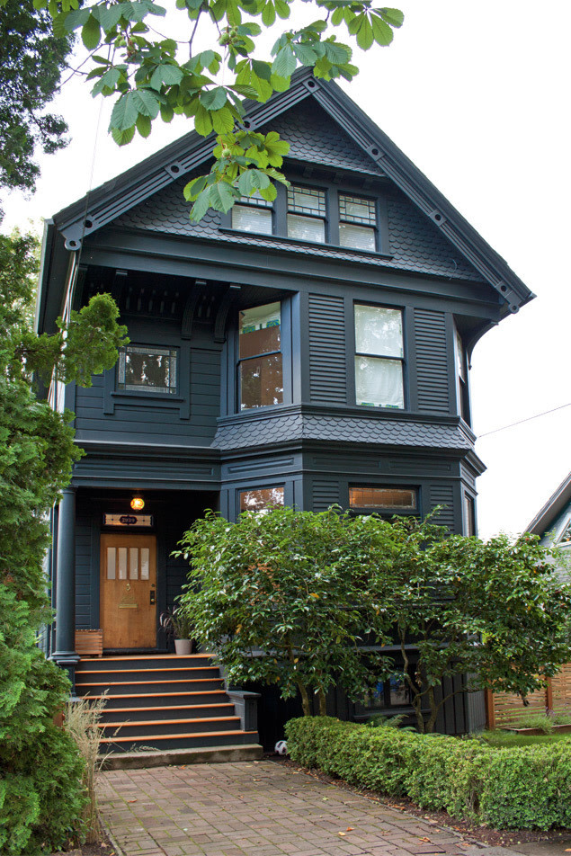
Image: Leela Cyd Ross
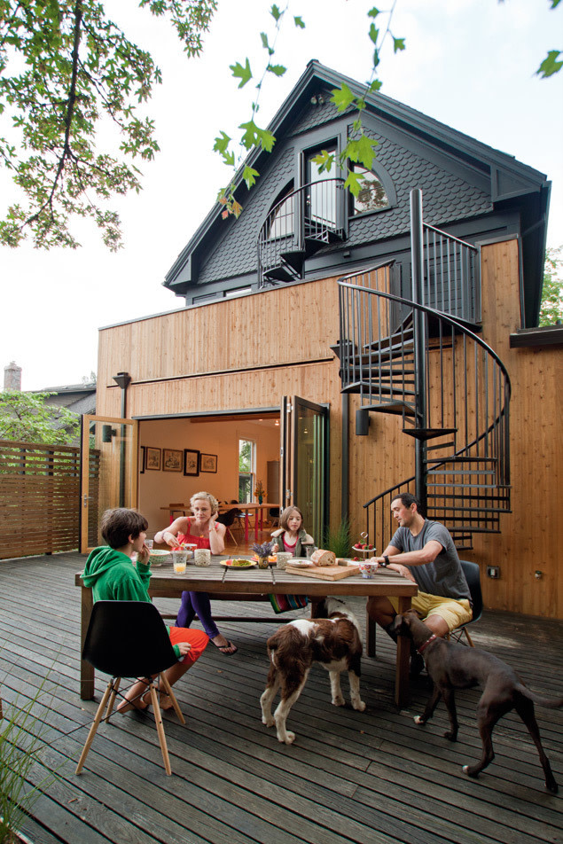
ON A QUIET, DEAD-END STREET IN Northwest Portland, tucked among tall swaying trees, is an elegant Victorian painted charcoal black. A shaft of sunlight falls through the expansive front windows, landing on a stuffed opossum hanging upside down next to the fireplace. An orange, ceramic owl winks from its perch in the gleaming stainless and white kitchen, and a painted strip of neon pink lines the dining-room threshold. Forget traditional 19th-century style—when British transplants Stephanie and Phil Dickinson bought the place, they were determined to redesign “Victorian” for their modern family’s taste and needs. “Our aim was to have the workmanship of an old house but not to be beholden to that point in time,” says Stephanie. “We wanted to bring it into this century.”
A creative director of sportswear at Nike and a handsome Brit with a roguish sense of humor, Phil suddenly found himself transferred to Portland. After a few months of surfing online real-estate sites, Phil found a close copy of the family’s Victorian home in London, a house alike in both vintage and interior layout (though bigger). The similar location—on a street overrun with children and close to schools and parks—sealed the deal. “I wanted my family to feel settled,” says Phil. So he bought the house (sight unseen by Stephanie except for some e-mailed photos) on a quick trip to Portland and then, after admiring a new house they had designed in Southwest Portland, contacted Kricken and James Yaker of local design firm Vanillawood to help with what was to be just a basic kitchen update and touch-ups of bathrooms and paint.
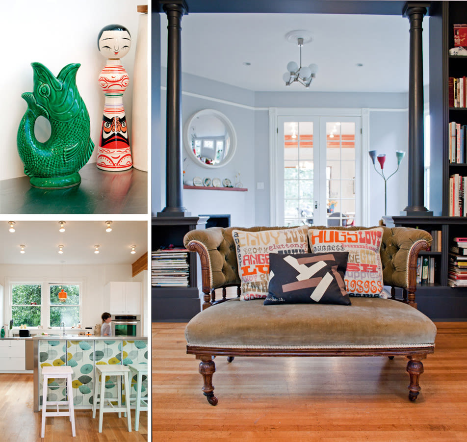
Inside muted paint colors, understated light fixtures, and clean architectural lines are a blank canvas for the family’s funky leanings. “It’s about inflicting our personality in things that can be swapped out,” says Stephanie.
Image: Leela Cyd Ross
For Stephanie, an attractive blonde whose casually chic style and no-nonsense air belie a razor-sharp wit, however, it was more shock than love at first sight. Fresh off a plane from London with their two children in tow, she stepped over the threshold, kicked aside dead beetles and piles of withered leaves, and wondered what her husband had been thinking. “Outside, it was painted six or seven colors of cream, red, and green, and inside, it was dark and oppressive,” says Stephanie with a slight grimace. A stay-at-home mother with a previous career in television directing, animation, and branding, she shares her husband’s aesthetic—but this house
wasn’t a match. “It hadn’t had any work done for a long time, and the kitchen was a horrible ’80s kind of thing,” she says. James laughs, remembering bringing pizza and beer over to the family to welcome them home that first night. “I thought she was going to move right back to London.”
The scope of Vanillawood’s work with the Dickinsons suddenly grew from a small touch-up and kitchen remodel to a whole house renovation. “It was all about opening up the rooms so that if they were doing different things, they could still be together as a family,” explains Kricken. “Plus, we wanted to emphasize indoor–outdoor living and bring in more light.”
The remodel took place in three phases. First was a simple six-week process of painting and minor work (adding a closet here, putting in new sinks there) on the second floor to complete daughter Mary’s and son Stan’s bedrooms and baths.
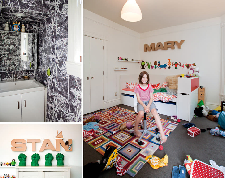
“A lot of our style is about comfort and usability,” says Stephanie, as evidenced by the wallpaper of the upstairs powder room and the playful childrens’ bedrooms.
Image: Leela Cyd Ross
The second phase was far more extensive. To realize Stephanie and Phil’s desire for one big cooking-and-dining area, the designers transformed the cramped galley kitchen and two adjoining rooms into one large box, an entire side finished with a wall of massive glass doors that fold back to seamlessly connect to an expansive deck. Since the framing was complicated—requiring the services of architect David Alt, plus structural support of two giant exposed horizontal beams and concrete footings below—what was initially conceived of as a short project of a few weeks dragged on, courtesy of slow city-permitting, to five months, including Christmas. The Dickinsons found themselves stirring up dinners on a small camping stove in the living room, a tarp covering the exposed back side of the house as chilly winter rains poured outside. “Our motto was a British slogan,” says James, “‘keep calm and carry on.’” In the final remodeling phase, a badly planned third-floor attic space became a master suite, complete with a sun-dappled, glassed-in shower-and-bath area and plush dressing room.
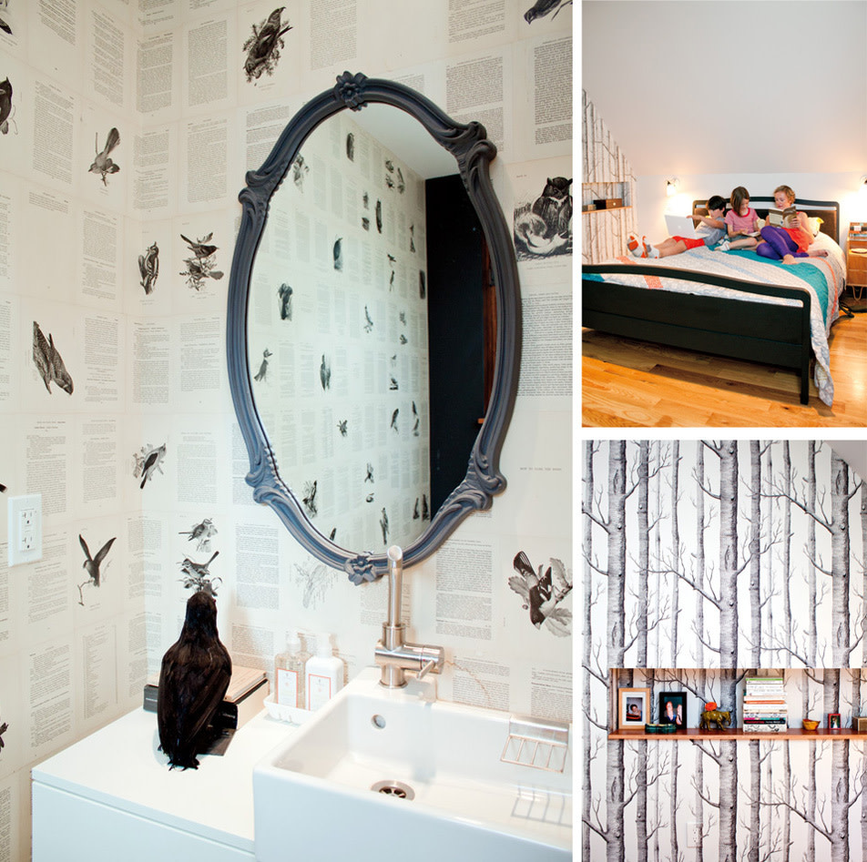
Pages of an ornithology book paper the downstairs powder room walls (left), and quiet forest wall-paper sets a contemplative tone in the master suite (right).
Image: Leela Cyd Ross
The overall style Kricken describes as “urban modern meets eclectic, funky, tongue-in-cheek spunky.” The family isn’t concerned with having the house reflect a certain era; instead, there’s a smart mix of both old and new. “We have stackloads of historic homes back in London,” says Phil. “Here, if you do midcentury modern or faux farmhouse, people want it all that one style. Being English, we just picked a bunch of stuff we liked, mashed it all up, and now chill out and enjoy it.”
It’s a theme that runs throughout the whole house. In the living room, squashy vintage couches feature pillows made from old British tea towels while retro-mod metal chandeliers from the ’70s hang overhead. Old French armoires hold dishes and kitchenware next to a table that Phil made from two long Ikea work surfaces, the bases of which he painted neon pink, while stainless steel kitchen counters shimmer nearby. Stephanie wallpapered one bathroom with pages of an old ornithology book; upstairs, a small office is hidden behind what appears to be a solid wall. Pops of orange and pink appear throughout, set against mostly neutral backdrops. Even the exterior deliberately contrasts the warm cedar siding of the deck-and-kitchen remodel against the all-black color of the rest of the house.
“I think we created a beautiful family home infused with all our playful flavor and fun,” says Phil. “After all, it’s nice to have a bit of irreverence in life.”