Pantone Gives Color Clues
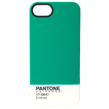
Image: Courtesy of Pantone
With every new year comes a new Pantone color of the year. And for 2013, the winner is: Emerald. Pantone's annual choice always comes after copious research. (They are the design industry leader in all things color, after all.) First Pantone polls designers and industry insiders to see what colors they're using. Then they convene an in-house color committee to review poll results and also which color swatches are being ordered by their own customers. Finally, they declare a winner. It's a bit like the Oscars, but without the red carpet.
Last year, a bold, vibrant Tangerine Orange got the nod. This year, it's a color they say is “vivid, verdant” and “promoting balance and harmony.” It's also "a throwback to the 1980s," according to the company's "color specialist," Leatrice Eiseman. That is, the booming economy of the Reagan era, complete with shoulder pads and bow-tied power suits for women, mauve and muted turquoise post-modernism for buildings, and sundried tomato pasta salads for Silver Palate-loving home cooks.
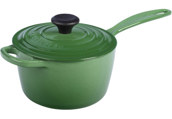
Image: Courtesy of Le Creuset
As the Wall Street Journal's Christina Binkley notes, "greens like chartreuse have been trendy for the past decade, but emerald hasn't touched the zeitgeist since Ronald Reagan was president... The color looked just fusty enough to feel retro-fresh when Angelina Jolie, Mila Kunis, and Catherine Zeta-Jones all donned emerald gowns for the 2011 Golden Globes."
Indeed, color fashions are fascinating. Even without thinking about it, you know when a color is old or new, out or in. Sometimes, you may be left wondering if a person is "way behind the times or way ahead of their time" (a comment I've heard about my own style choices, I admit). Some colors are timeless (black, white, denim blue...), but others scream out their year of origin as loudly as the Space Needle says 1962. Avocado green, for instance. In many cases, you can tell a book by (the color of) its cover. Or know when a kitchen was last renovated, just by the color of its counters, cabinets and fridge.
Image: Courtesy of Penguin Books
Jonathan Adler, a true color-lover if ever there was one, has just teamed up with Kohler to introduce four colors to that company's offerings for kitchen and bath. His colors are appropriately bold and named for appropriately posh places: Piccadilly Yellow, Greenwich Green, Palermo Blue and Annapolis Blue.
Historian Regina Lee Blaszczyk recently published The Color Revolution (MIT Press), a "history of the relationship between color and commerce." Long before the internet or even TV could transmit styles, public figures made color choices that the hoi polloi then tried to emulate (like Queen Victoria and the mauve gown she wore to her daughter's wedding in 1858; "the color became so popular that the 1860s came to be known as the 'mauve decade,'" Ms. Blaszczyk says, according to the WSJ).
Since Pantone polls design industry people as part of making its color choice, many companies will have new products in just the color that Pantone has picked to be it for 2013. For instance, malachite wallpaper in emerald by Cole & Son; Le Creuset with a new line of kitchenware in a slightly moderated emerald tone they are calling fennel.