When it Comes to Choosing Paint Colors, These Portland Pros Keep it Simple
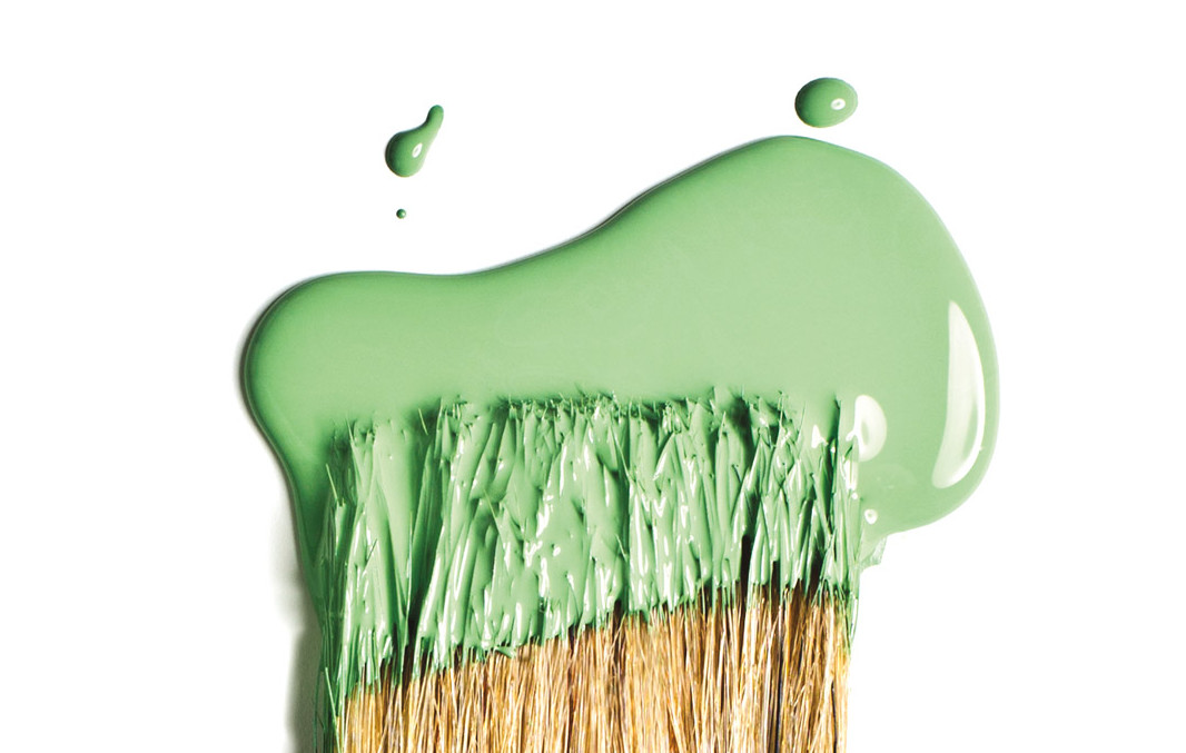
Image: Michael Novak
The biggest challenge in selecting interior paint? “It’s too much choice. People are really afraid of choosing colors,” says Puji Sherer, “chief color nerd” at Colorhouse since 2005. At the company’s Northeast Portland headquarters, Sherer helps customers navigate the intimidatingly infinite color spectrum. Part of the solution, in her case, is that unlike most paint companies, Colorhouse works with a constrained palette of just 128 paints—all of them free of VOCs (volatile organic compounds), reproductive toxins, chemical solvents, and toxic fumes.
“The big guys—Sherwin-Williams, Behr—they have thousands of colors to choose from,” says Sherer. “And not all of those colors are great for architecture. For us, we’ve got 21 blues that all have their own individual essence.”
Since the company’s founding in 2005 by two local artists, Colorhouse has released a new collection every few years to keep up with the latest tastes. (In the mid-aughts, heavy chocolates were the hot pairing; these days, gray undertones are trending.) But Colorhouse has been careful not to overwhelm customers with choice. The editing seems to work: the company boasts a less than 1 percent return rate on gallons of paint, even when customers select paint directly from their website.
“When you take a color from a teeny, tiny chip and blow it up, it can get mean pretty fast if it doesn’t have the right undertones,” says Sherer. “We work to design all of our colors to be backdrops for living. Even with our brightest colors, we design them to sit back a little, so you can live with them really easily.”
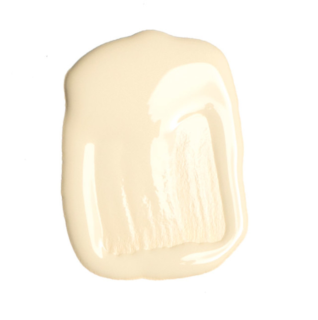
Image: Michael Novak
Beeswax .01
Inspiration: Honeybees
With a slight earthiness, this muted yellow makes any kitchen feel sunny without garish brightness. “Bee Local is using our paint on some of their hives, so we worked with them to create a honeycomb palette.”
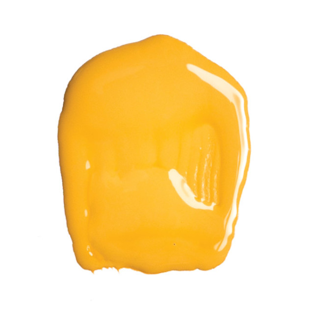
Image: Michael Novak
Wood .01
Inspiration: Fall
This “unusual” color is best paired with raw wood cabinets or dark, rich painted grays, especially in dining rooms or kitchens. “Fall is when really significant meals take place. This is a really yummy orange—basically the color of butternut squash.”
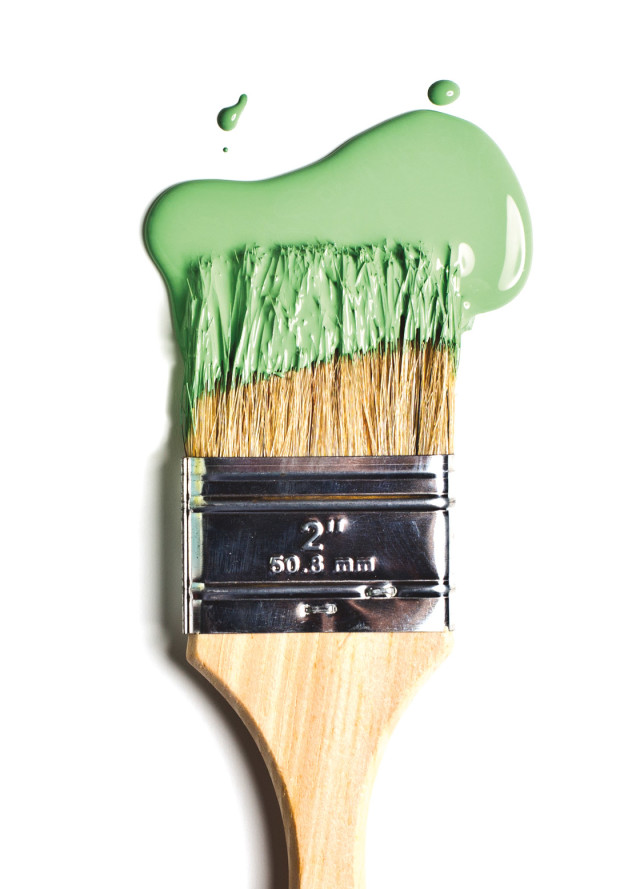
Image: Michael Novak
Thrive .05
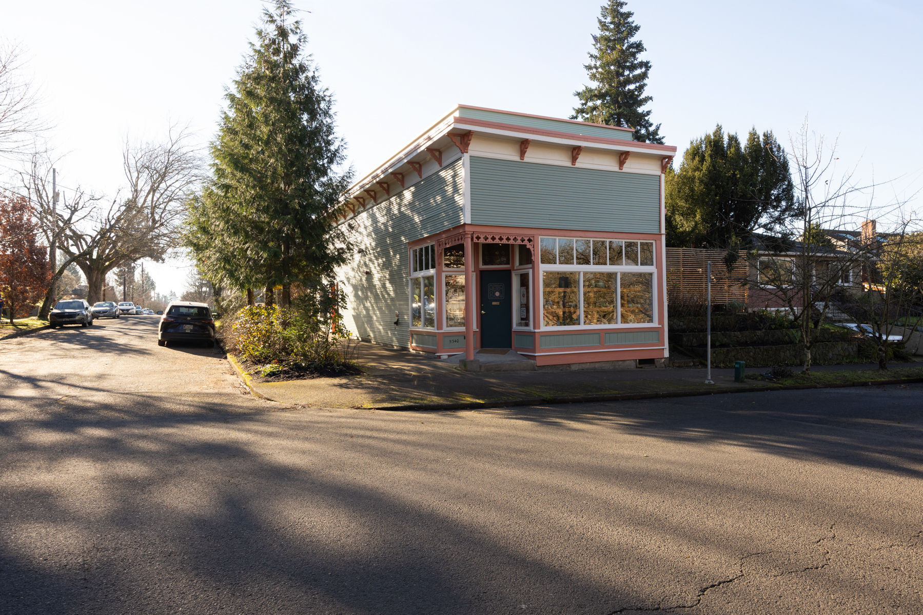
Inspiration: St. Johns Bridge
Part funky, part quaint-cottage, this vintage green is great for bedrooms or a pop of color in guest rooms. “I actually have a St. Johns guest room in my house,” says Sherer. “Sometimes guest rooms are fun to add a little personality to because you’re not sleeping in them all the time.”
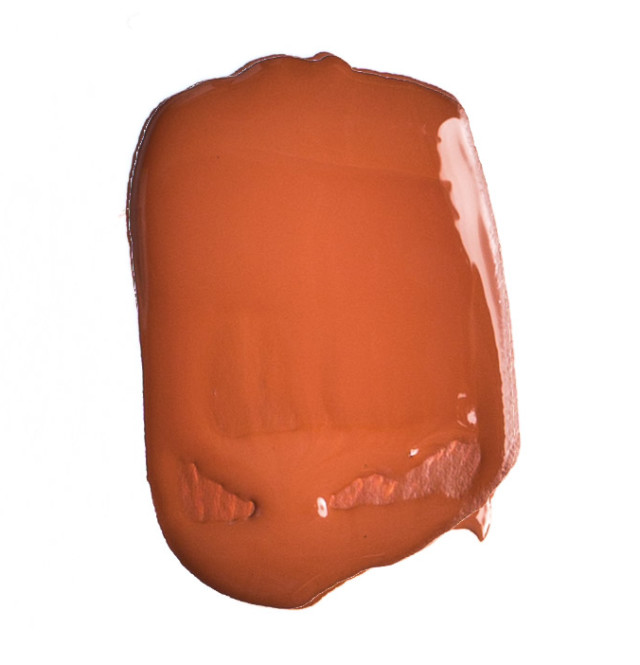
Image: Michael Novak
Clay .04
Inspiration: Oregon’s Painted Hills
This bold hue will add warmth to any room where people are gathering, like a dining room. “When our founders were first launching the company they went to the Painted Hills, and the colors there became our clay family. There’s a real connection to Oregon there.”