A Color-Coded Look at Portland's Urban Growth
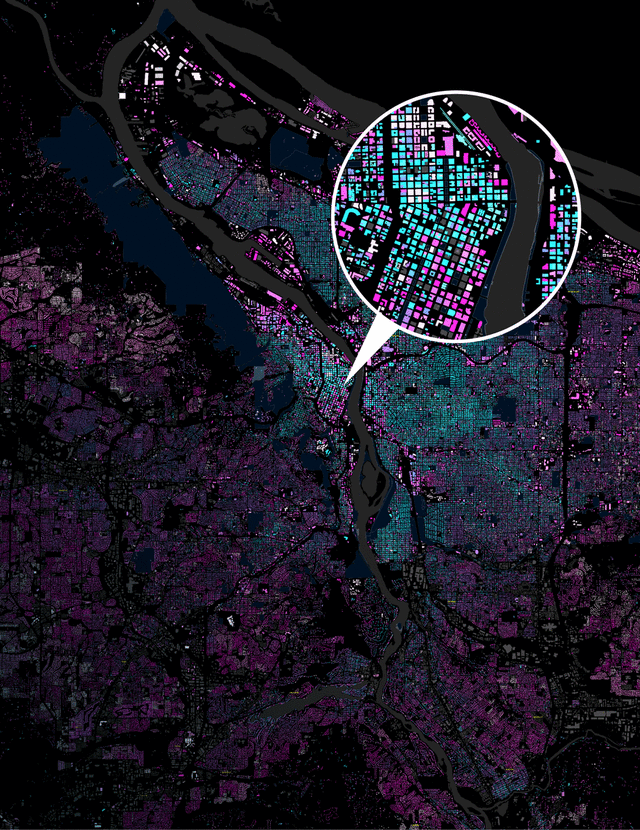
Image: Courtesy Justin Palmer
On Justin Palmer’s map, Union Station turns a sprightly shamrock. Gresham’s cul-de-sacs blossom into intricate whorls of violet and pink. Zoom out, and the city becomes a mottled wash, from a green-blue core to bruise-purple outskirts.
Portland, Oregon: The Age of a City color-codes every building in the metro area according to year of construction. Older buildings splash in a cool green-to-blue spectrum, while anything that could be called “midcentury modern” throbs a shade of purple. The newest buildings, coded in white, stand out like icebergs in a hallucinatory sea.
“It’s a bit of a hobbyist fascination with urban planning,” says Palmer, a 33-year-old web developer who created the map after finding a City of Portland database online. He notes that his color-coding reveals the outlines of Portland’s old streetcar network, as well as I-205’s role as a Berlin Wall between eras of construction.
Beyond the beauty and braininess, Palmer sees the work as a tribute to open access to information. “It’s important to validate local governments releasing and maintaining interesting data,” he says. “This is a great way to show them that this is something we want more of.”