How One Portland Designer Creates Entrancing Typography
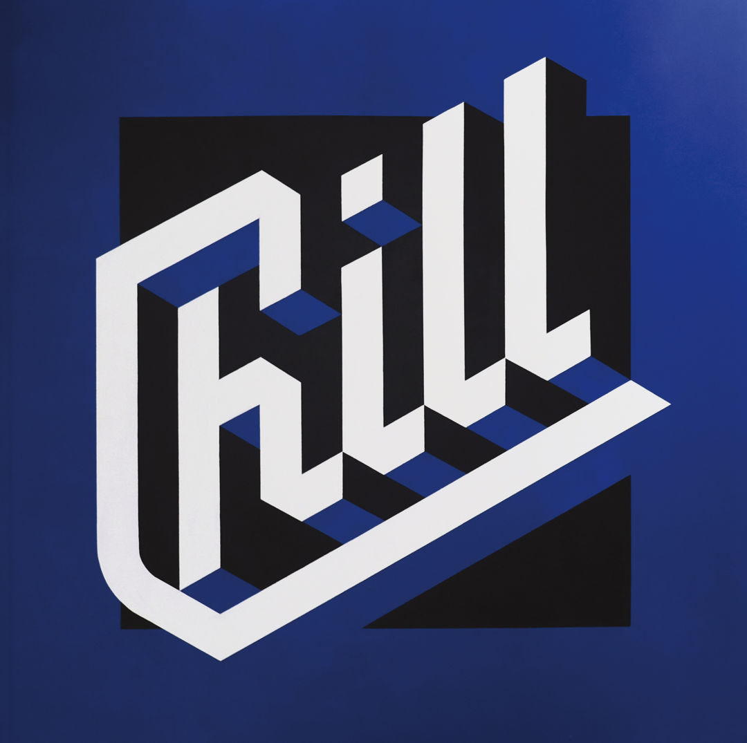
A mural for WeMakePDX
Image: Courtesy Jordan Metcalf
It was 2009, and Jordan Metcalf was a 20-something living in his native Cape Town, South Africa, doing freelance graphic design and tooling around with typography in his free time. His lettering experiments had garnered some attention online, but an assignment from Nike—to create new takes on the company’s name, swoosh, and “Just Do It” slogan—was huge.
“It was so exciting,” Metcalf recalls. “I was just this kid in the middle of the suburbs. I was working from home then, probably sitting around in my bathrobe.”
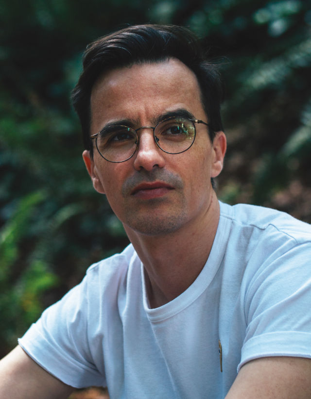
Image: Ryan Bush
That job helped catapult Metcalf from bathrobe-clad obscurity to (relative) renown as a custom lettering artist. In the decade since, Metcalf, now 34, has worked for clients ranging from National Geographic to O, The Oprah Magazine, Adidas to Adobe. Last summer, he and his wife—and their droopy-bellied cat, Catman—moved to Portland (where he still works from home, out of their one-bedroom Alphabet District apartment).
Metcalf’s lettering work includes both delicately filigreed book covers and magazine spreads that glow neon. He likes to explore depth and dimension, often in ways that couldn’t actually exist in 3-D: think of M. C. Escher’s optical illusions and impossible objects. That what he creates must also be legible—its words and phrases comprehensible without too much squinting or head tilting—makes it all the more satisfying. “I’ve always approached this as graphic design,” Metcalf says. “You’re trying to problem-solve.”
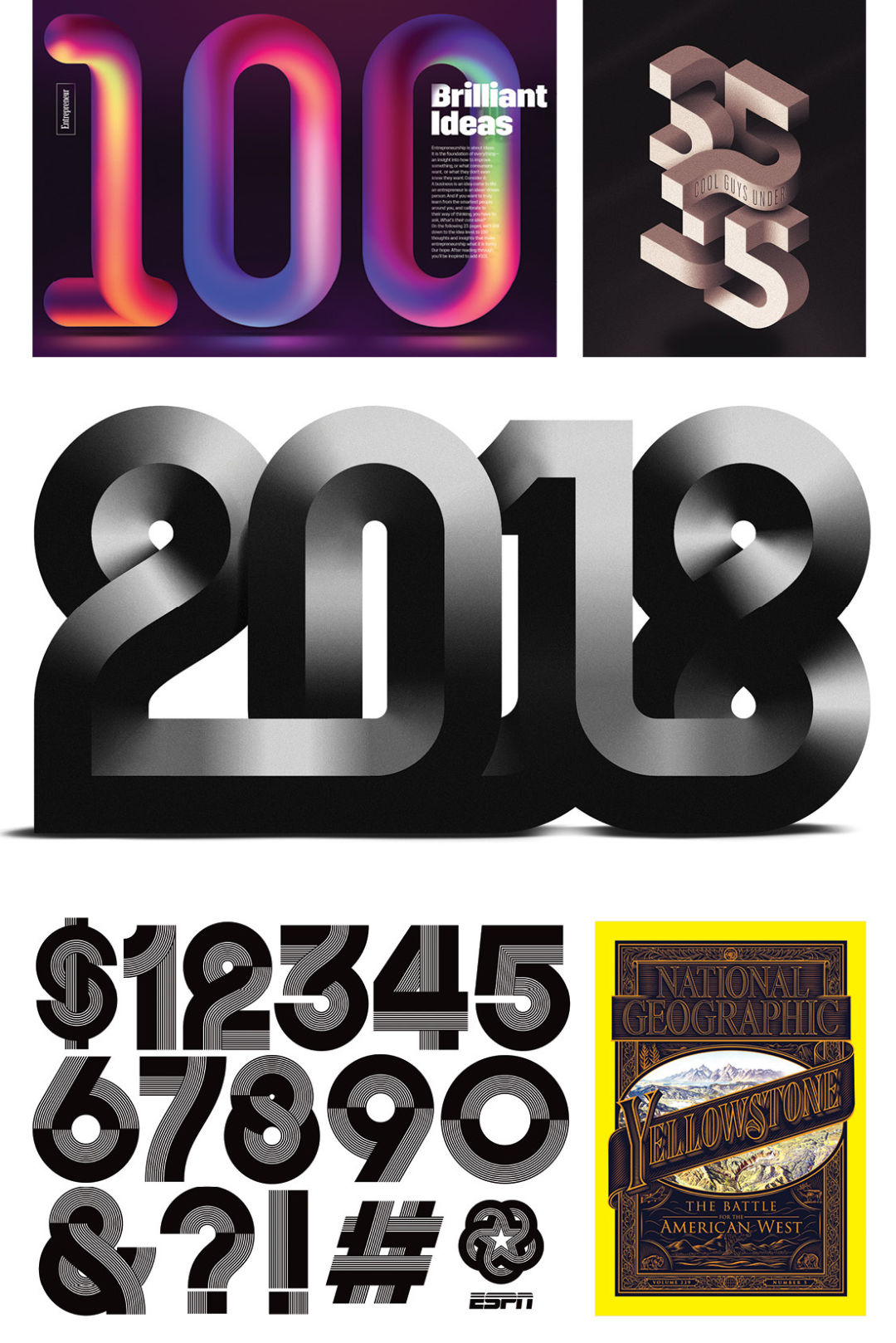
Designs for Entrepreneur, GQ, Money, ESPN, and National Geographic
Image: Courtesy Jordan Metcalf
A coup of Metcalf’s career was the cover design for a 2016 issue of National Geographic devoted to Yellowstone National Park—a place he had never visited. (“I definitely felt so much pressure because I’m not American,” he says.) He plunged into research, studying imagery of Yellowstone—signage, postcards, and other ephemera—as well as Nat Geo’s design over its history. The result: a famous Heinrich Berann painting of the park at the center, Old West-y lettering, and an ornamental border that evokes the magazine’s earlier years.
“That was the one thing where I think my parents understood better what I actually did,” Metcalf says. “It’s like, ‘Oh, shit! My boy is on the cover of National Geographic!’ My dad took the issue into his company and showed everyone.”


