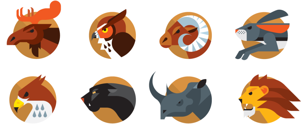
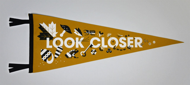
Always With Honor's Awesome Icons
This afternoon, Design Week Portland's opening slate features one of Portland's most distinctive design shops talking about what it does best, as Always With Honor conducts a workshop on icon building.
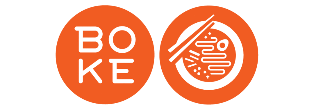
The collective design consciousness of Elsa and Tyler Lang, AWH creates whimsical (but sharp), slightly retro (but not too retro) graphics for the likes of Monocle, the New York Times, and The Fox is Black. Portland diners might recognize the firm's versatile branding and symbol work for Boke Bowl.
Before they reveal the magic secrets of making a good icon, Lookbook asked the Langs to talk through their story and work.
Q: If it were up to me, I would describe AWH's work as icon-driven, bold, simple, graphic but with a nod to the natural world. This is probably nonsense, so how would you describe it?
AWH: We're still trying to figure out how best to describe our work but you're on the right track! We like to think we aim to simplify without sacrificing too much charm. We want the work to be bold and clean, but never at the cost of feeling cold and lacking personality. It's a fine line, but when you have the right balance the work lets you know. We also try not to take ourselves too seriously. Hopefully that shows in the work as well.
Q: What's the brief history of the firm?
We met through mutual friends at art school in Florida. The day after graduation we moved up to NYC and each worked at various studios. We shared a Tumblr called Always With Honor where we would post late-night sketches and collaborative projects, and we began receiving freelance jobs pretty regularly through that. After a couple years in Brooklyn we decided to head west to start our own thing in Portland. We've been at it since we moved here four years ago and couldn't be more delighted.
Q: Why Portland?
Even before moving here we both always liked what the Pacific Northwest represented: a strong passion for the outdoors, top notch food, and a great dog culture—the AWH holy trinity! Portland has the perfect mix of quality usually associated with a global city while still being able to pull off that small town spirit and grit, which made it the ideal place to begin tinkering.
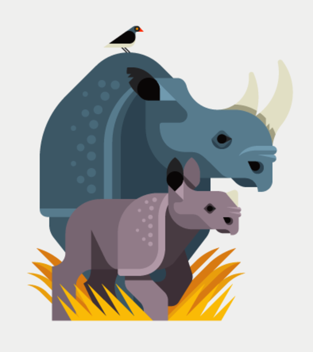
Q: Expanding upon that last question, with your killer whales and bears, is there a Northwest Native American note you aim to strike?
Perhaps not intentionally. But I think we probably share many of the same ideals and appreciation for the natural world. Growing up in Vermont, Tyler's family would visit his grandparents' camp on the weekend and spot deer, moose, sometimes even a bear. Animals have just always fascinated us, native to the surrounding area or not.
Q: As your Design Week event suggests, you have quite the way with icons. What makes a good one?
If we say love makes an icon successful, would that an absolute cop-out? A good icon should feel 100% true to the subject matter it's conveying, which means having a great understanding of what makes the subject matter tick. It's the subtle cues that really make a difference when you're working with such little real estate. Each angle, curve, and stroke should be intentional and considered and reconsidered to a sometimes absurd degree.
Q: What seems to bring clients to you? What problems are they trying to solve?
In the simplest terms clients are looking to us to inject a bit of the AWH personality into something that may need a little life. The work comes in all shapes and sizes: icons for a smartphone app, branding for restaurants, beer packaging, environmental displays, event illustrations, you name it.
Q: If the City of Portland came to you and asked you to redesign the city's flag, what would you say?
We would start by requesting gift vouchers to each restaurant and bar in Portland—you know, to really get a vibe of the city. Courtside Blazers seats, too. Then we could finally begin work on a flag that encompasses that big-city quality and small-town passion mentioned above. Then we'd convince the committee to scrap the entire project, because we'd realize how great Portland's flag already is. Ok, well: maybe just convince them to nudge the cross of the flag to the vertical center. Simple as that.