The Crazy-Tight Deadline that Helped Simple Create a Beautiful Logo
The Simple logo.
Ian Collins, creative director for a nascent company called BankSimple, was on vacation. Well, he was deep into building a wedding venue on his parents’ property in the Sierra Nevada foothills of California, leaving the various branding puzzles that faced the Portland start-up rattling around in the back of his mind.
It was summer, 2011, and the company was still taking baby steps towards its concept: a sleek, user-friendly, technologically enlightened interface for modern banking, with customer-service practices and a whole aesthetic vibe counter to the grim prevailing standards of the financial services industry. The start-up had moved from Brooklyn to Portland, in fact, in large part to tap into a culture, as one of its founders said at the time, "where people are friendly, but...still very passionate about what they do." Its whole brand identity needed work.
“We had a $100 logo off the Internet, but we were a startup, so no one cared,” Collins recalls. “I had been exploring options. I wanted to be called Simple. But we were really in an in-between state, and no decisions had been made.”
Then he got a phone call from home base.
“They were like, we have to file for a trademark soon, and we need a logo,” he recalls. “And I was like, ‘when?’ And they said, ‘um, 3 pm.’
“That’s about as good a deadline as you can have.”
Fortune favors the prepared mind, as they say, and Collins already knew a lot about what he hoped to evoke with his company’s new mark. “We want to feel like a bank,” he says. “And we want to nod to tech, because that’s an important part of what we’re doing. But at the same time, we want to nod to an older world of banking—a pre-credit card world, where you did business in person and the whole world of money was more solid and real.”
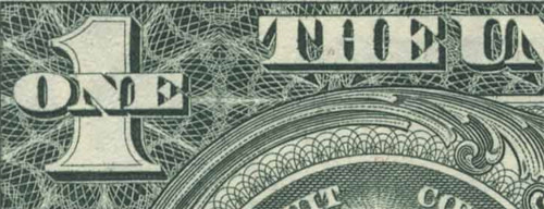
Guilloche patterns are traditionally used as a security and authenticity tool in currency and financial documents.
He had already gravitated to the idea of using a guilloche pattern: intricate geometric engraving, traditionally used as an anti-counterfeiting device on currency and official and financial documents. Now, facing this tight deadline, he wrote a custom Java script to generate the guilloche’s looping, spirograph-style lines by generating interlocking mathematical sine wave patterns around a circle.
Once he had his basic guilloche (which would be slightly—yes—simplified as the branding evolved), Collins set about picking a typeface for Simple’s wordmark. In the end, he gravitated to Gotham, the very popular throwback font developed in 2000 by the famed type foundry Hoeffler & Frere Jones. “It’s arguably over-popular,” he says. “But it’s a modern version of old typography found around Grand Central Station in New York, and it evokes the era of culture I was interested in. I experimented with a lot of fonts, but in the end, Gotham was just right.”
The result: an instantly recognizable mark that seems suited to a long run as the company’s symbol: ironic, given it’s almost-instant creation.
“I think I showed a couple versions and, in the end, we just picked one,” Collins says. “I was happy to be locked into a tight timeframe.”

Simple creative director Ian Collins. (Photo courtesy the larger person)