Apple Season Indeed
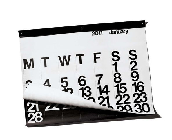
An appreciation for typeface design – here, Helvetica in the iconic Massimo Vignelli calendar – is part of the legacy Steve Jobs has left us with.
It seems somehow fitting that Steve Jobs passed away during apple season. The changes he helped bring to our daily lives are as ubiquitous as his company’s namesake fruit. But besides revolutionizing how we listen to music and communicate with each other, he raised our level of design consciousness and appreciation.
The recently published book Just My Type: A Book About Fonts tells an anecdote that reveals how Jobs’s influence went beyond the obviously elegant design of the computers, phones, and music-playing machines he brought to life, and into the less considered realm of typeface design. Simon Garfield’s book is a history of fonts – a word that perhaps few of us would even know were it not for Steve Jobs. Now, five-year-olds can tell you what a font is.
In his introduction to the book, Garfield relates an anecdote that Jobs told at a Stanford commencement address in 2005. Jobs remembers having dropped out of Reed College (who knew he was a Portlander at some point?), drifting around campus and noticing the lovely lettering on the campus posters. They were calligraphy, and he decided to learn it.
Years later, developing his first computer, he incorporated a choice of fonts the home typist could pick from. Freedom of choice – so American! But also so design-savvy, so sure that the average person would notice the difference between typefaces, would care to choose between them, and would pay attention to how the design of a thing affected the expression of the content and the experience of the user.
Of course Jobs was right. The “menu of fonts” he invented was revolutionary at the time; now it is commonplace. Garfield’s book quotes from the commencement speech as Jobs describes what that calligraphy class in Portland taught him: “I learned about serif and sans serif typefaces, about varying the amount of space between different letter combinations, about what makes great typography great. It was beautiful, historical, artistically subtle in a way that science can’t capture, and I found it fascinating.”
Garfield’s book takes off from Jobs typeface epiphany and offers much more about what fonts mean, how they get made, and why there are more than 100,000 of them today. Meanwhile, our homes show off our font choices in various ways, from the address numbers outside our front doors to the calendars and posters inside. An example is Massimo Vignelli’s Helvetica calendar, designed in 1966 and immediately put into the collection of the Museum of Modern Art. It makes a bold statement that many an architectural office has echoed – including the first one I ever interned in, where I was introduced to the timeless calendar. Perhaps, thanks in part to Steve Jobs, fond appreciation of fonts has grown beyond the realm of the architectural fetishist.


