Can You Judge a Beer By Its Label?
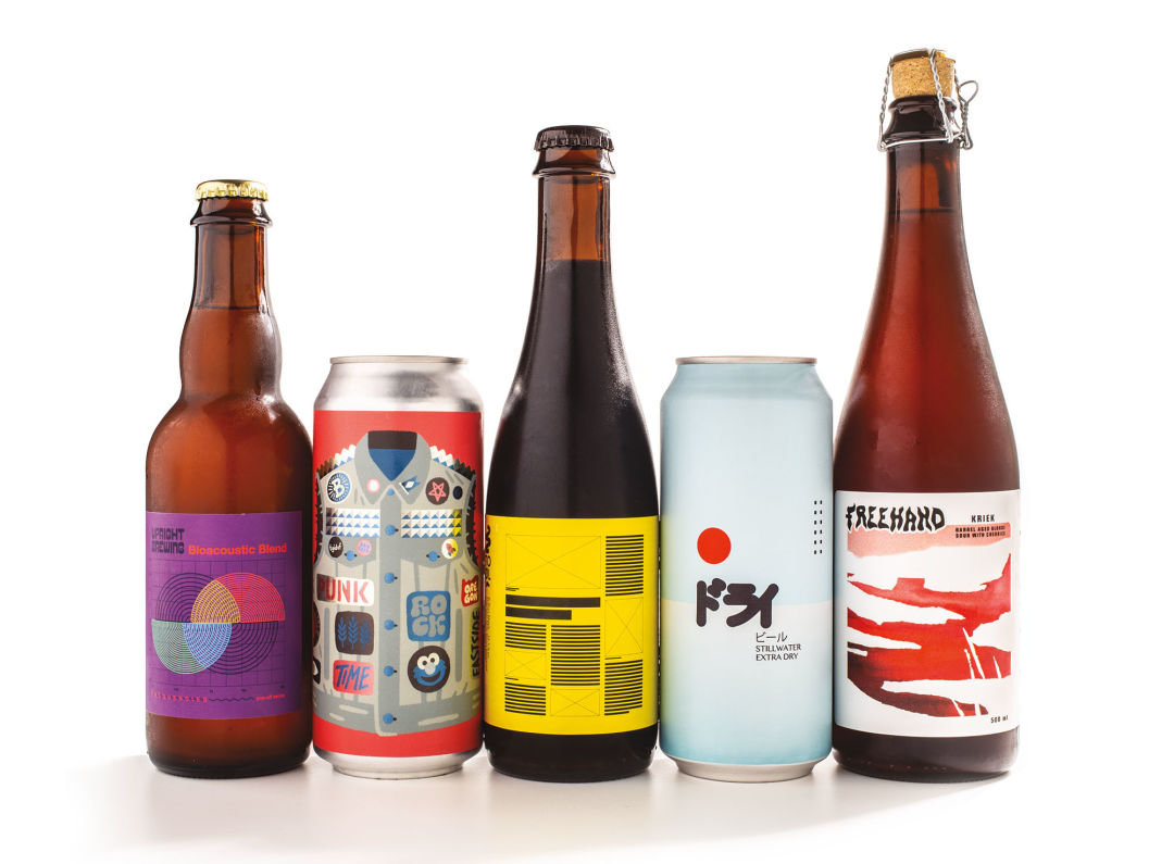
Image: Michael Novak
For too long, beer branding has left no doubt of the intended target: a manly man who rejects fancy stuff like color or any imagery more elaborate than a picture of a mountain. Things got even more embarrassing when the first wave of smaller breweries decided to cut loose in MS Paint and doctor up some clip art of a hot, ’50s-era chick leaning on the name of their beer—maybe called “Lil Bit O’ Business Time Stout,” set in Comic Sans typeface.
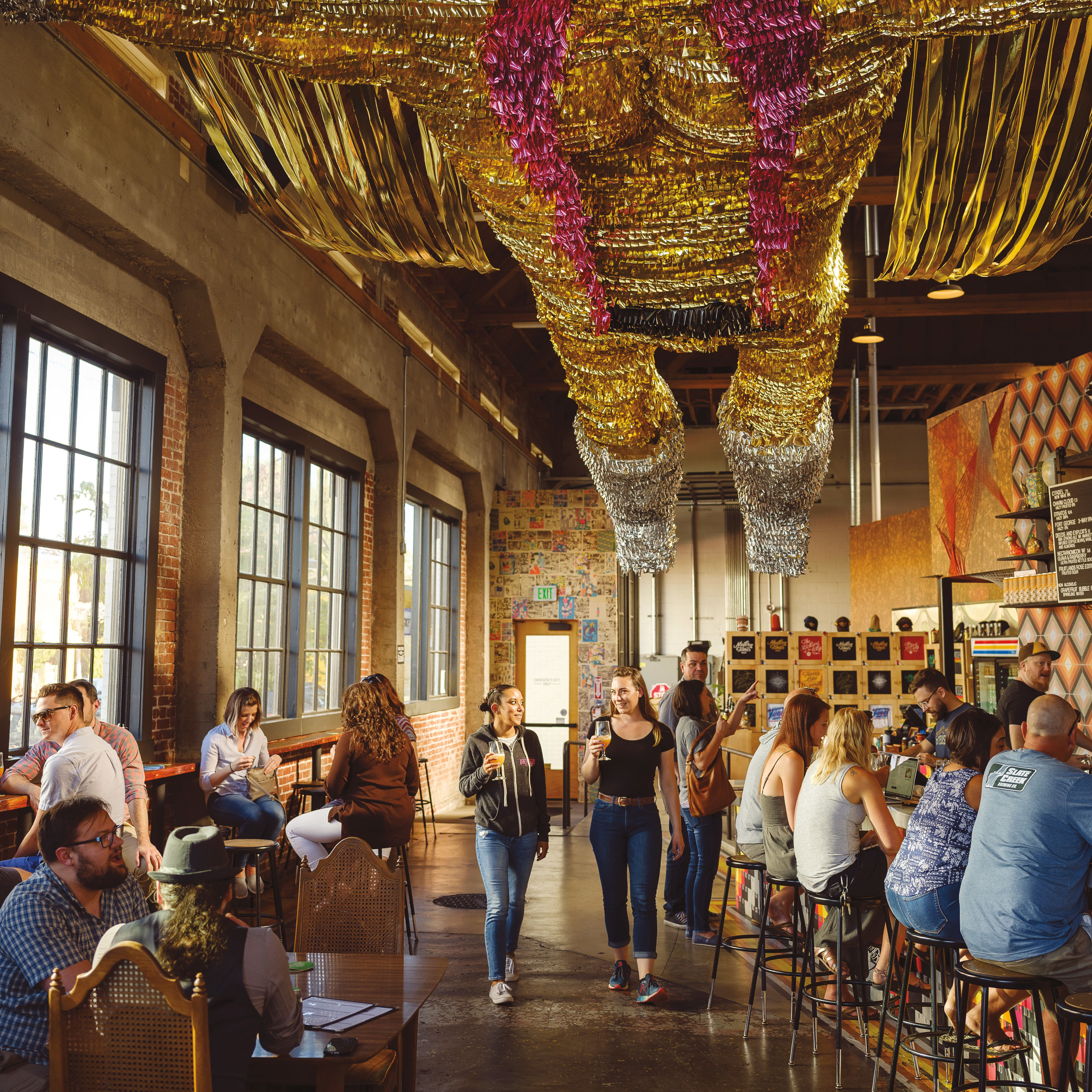
It’s a little better now. In the current era, brewers need to stand out on crowded shelves, offering up tons of real estate for talented designers and illustrators to go wild. I walked the aisles of Southeast Portland beer mecca Belmont Station and used my powerful design brain to find the best of the best. (Tasting notes provided by PoMo staff.)
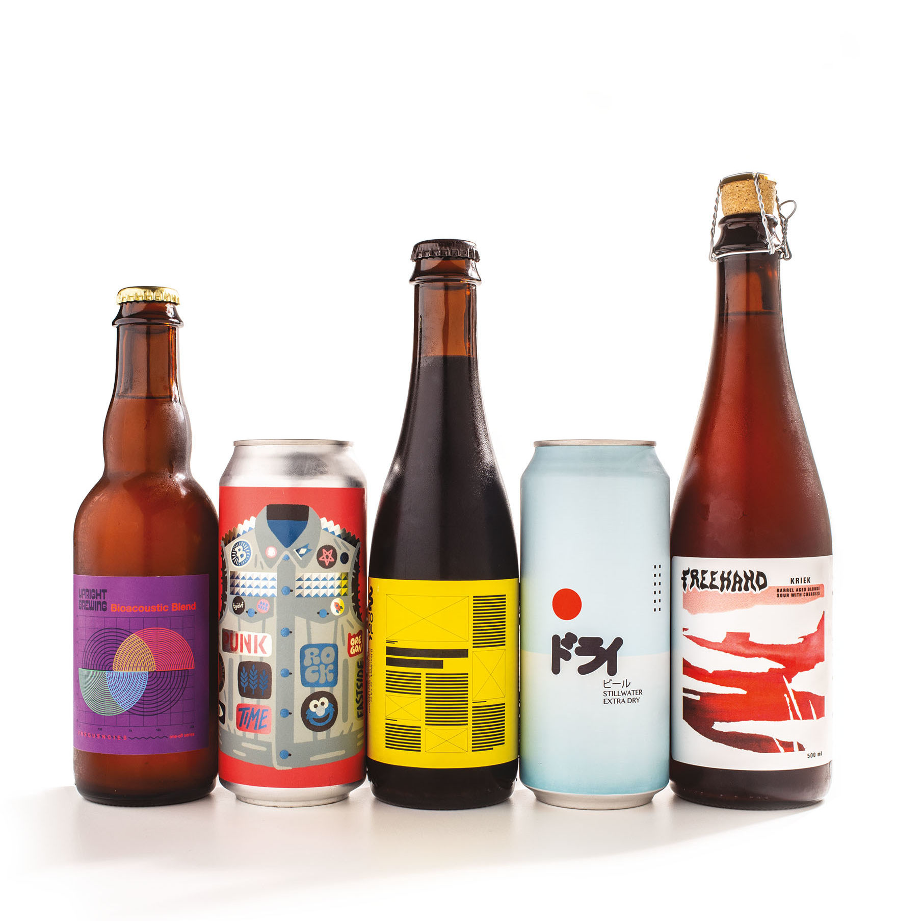
Upright Brewing Bioacoustic Blend
I knew I’d find some Helvetica in the beer aisles; it’s the world’s most popular typeface, after all, and it can lead to some lazy choices. But this Portland brewery’s design embraces Helvetica’s midcentury origins in a creative way. The illustration brings to mind a diagram in a ’50s science textbook, the concentric circles and overlapping lines suggesting a “bioacoustic blend.”
Verdict: The label feels off. The taste is more complex than Helvetica’s simplicity, with some serious backend funk.
Baerlic Beer Company Punk Rock Time IPA
Any commercial product that uses the phrase “punk rock” runs the risk of looking hopelessly corny, but the designers walk the line perfectly here. This label, with its adorable vector artwork and zany but well-considered typography, is exactly what the doctor ordered. The Portland brewery’s tasteful use of matte and metallic inks brings the textures of the studded denim vest to life, and the color choices are refreshing and fun.
Verdict: The vest is spot-on. Skunky, punky, it’s a mean daddy of an IPA.
To Øl B-Bon Mælk
Leave it to the Danes to knock this out of the park. This label must have been designed to appeal to me personally—there’s no huge logo or typography, and it features a bold yellow-and-black color scheme. It’s also a mock-up of an editorial layout. The boxes with ‘x’ in them are photos, the large black bars are the hed (headline), and the thinner bars are copy and photo captions. Every Portland Monthly story layout starts its life in this form. Nerdy? Probably. Cool? Definitely.
Verdict: Neither clean nor crisp, this syrupy, smoky beer tasts like something you’d pour on waffles. It’s ... a lot.
Stillwater Extra Dry Sake Style Saison Ale
Refreshingly, this Japanese-inspired design lets the space do the talking. The bright colors, minimal typography, and ambiguous yet geometric shapes suggest confidence and precision.
Verdict: The taste is as clean, bright, and uncluttered as the light blue can. It’s like stepping into an ice box.
Freehand Kriek
I had a hard time choosing which of Freehand’s bottles to grab, since all of the Eugene brewery’s bottles feature similarly abstract, evocative artwork. This one feels impossibly classy, with colors and forms that recall a late-summer sunset or maybe the landscape of the American Southwest. Looking at this label and its sparse words, it’s easy to forget that only a few short years ago every beer was called “Dr. Mooseknuckle’s Redheaded Stepchild Red Ale.” Dark days, my friends.
Verdict: Blush, bashful, the color of orange wine. Something you might pour at a fancy summer BBQ.