A Traditional West Hills Ranch Shows Its Wild Side
To wit: When a jet-setting Belgium-born couple landed in Portland in 2018 with their two kids and bought a West Hills ranch house, they knew they needed to transform the staid structure into a place that would fit their eclectic art and object collection, amassed in stops across the globe.
But just as the walls would shape how the collection would be presented, the artwork itself would inspire the house’s new look. In China, years earlier, the couple (a marketing exec and a photographer) had acquired a print from Beijing-based artist and activist Liu Bolin. The striking 2012 photograph, called Hiding in the City – Kitchen Knives, shows a collection of neatly arranged knives with colorful handles, some bright orange, some bright green.
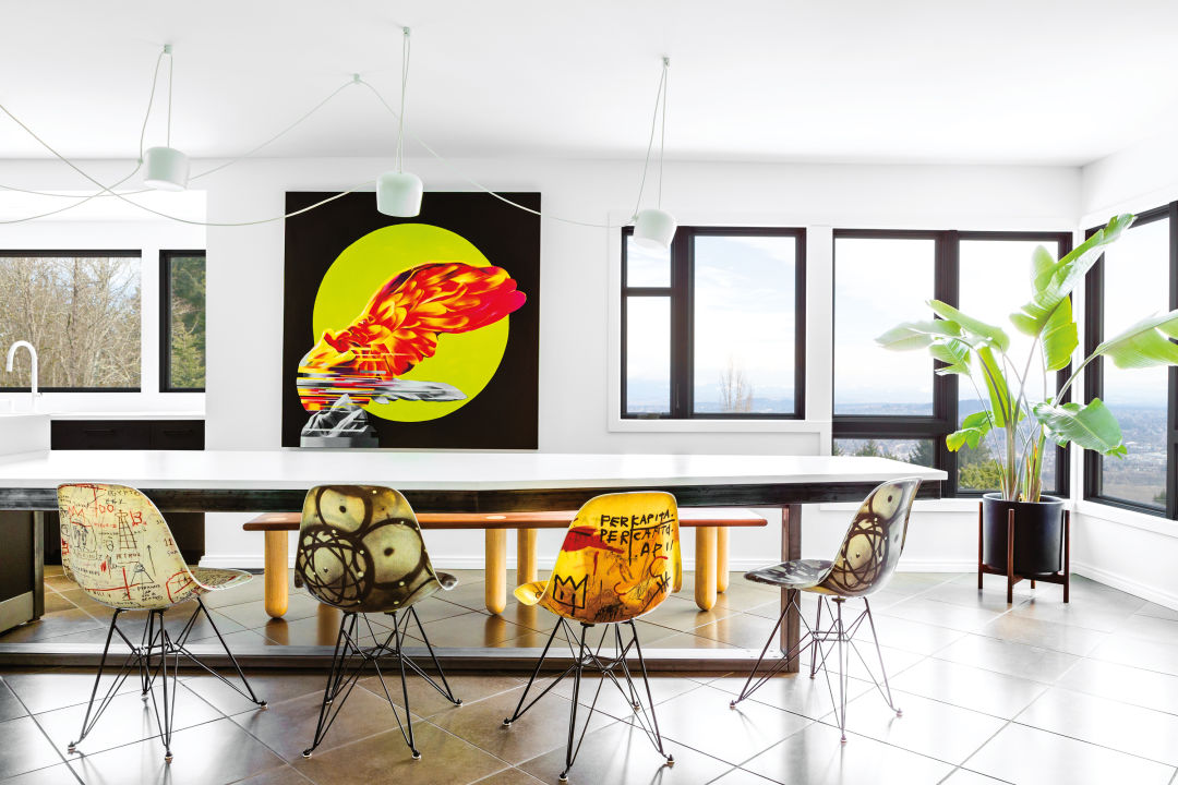
Image: Christopher Dibble
“The photo was where we got the color from,” says Stewart Horner of Portland interior , which was tasked with remodeling the home. The owners “really wanted a white house. We knew we wanted to keep it quite neutral with the oak floors, too. But they wanted to have a bold pop of color throughout, that was connected, that felt homogenously considered. I saw that [image] and it was stunning and I was like, ‘Let’s take some color from this.’”
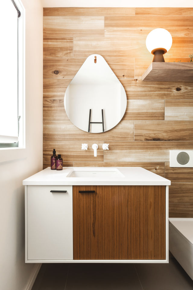
Image: Christopher Dibble
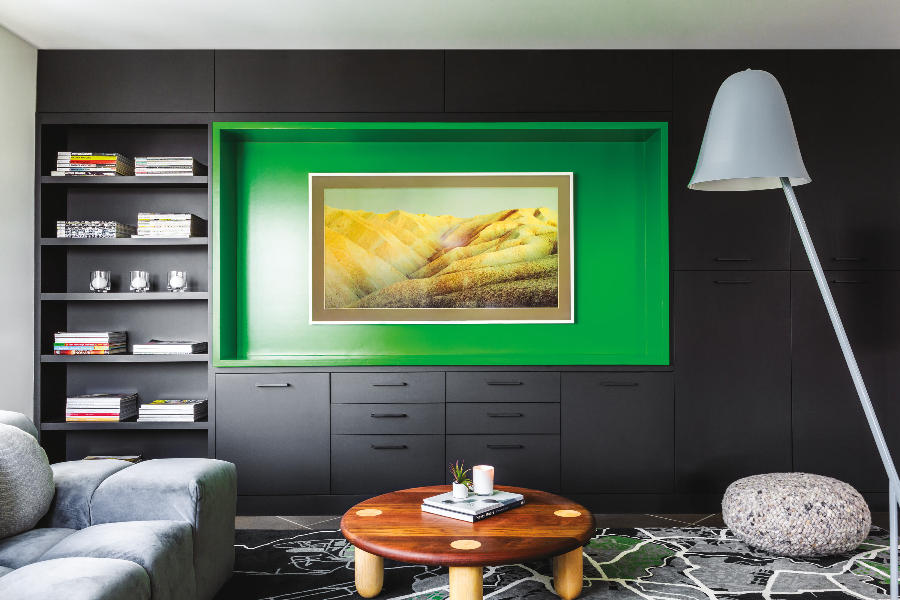
The rest of the 3,500-square-foot house eventually coalesced around Bolin’s nearly infinitesimal splotches of neon green: everywhere, clean white surfaces and stained woods were now interrupted with violent slashes of verdant color. In the living room, custom-made lime green armchairs—courtesy a collab with Kush Rugs—took pride of place in front of the fire. In the family nook, Horner mounted the TV within a bright green recessed frame and sat the B&B Italia Tufty sofa atop a custom rug flecked with green. (That rug, commissioned from Kush, shows a map of Addis Ababa, Ethiopia, where the couple’s daughter was born.) A massive, 20-foot-long kitchen island–cum—dining room table is centered by a painting of the Greek goddess Nike, silhouetted against a bright yellow-green circle. Even smaller details conspire to amplify the theme: the soap bottles on the bathroom shelves, the strategically placed succulents, the staged Granny Smith apples in the kitchen.
“It’s actually quite hard to place something as bold as that [green] throughout without it overpowering and feeling a bit strange,” Horner says. “We had suggested going with a green—because there was a lot of greenery outside the house—to connect the inside to the outside. But they didn’t want to do it in an obvious, neutral-tones way.”
One more feature guided Horner’s design hand: the couple wanted something light, bright, and airy. The ceilings were relatively low, and the walls had been painted with earthy neutral colors. The effect, Horner says, is that the space was dark and gloomy. Though the home sat overlooking the Portland city skyline, it felt like a bunker.
“The house should have had a spectacular view,” says Horner. “It was a really nice home, but it was really dated.”
The five-bedroom house was built as a “traditional” ranch, Horner explains, without midcentury touches like big, oversize windows to let light in. The dark, claustrophobic living room, where the couple anticipated spending most of their time, had only two small windows facing the city.
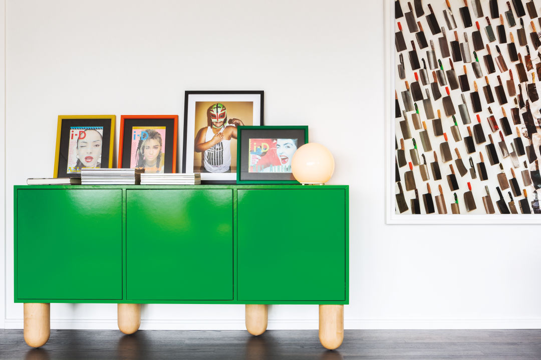
Image: Christopher Dibble
“The first design we submitted had this 20-foot-long, single-pane glass window that protruded from the house and angled a little bit so that it got the best view,” says Horner of their plans to “fix” the living room. “But they needed to access the deck, so we scrapped that notion. But that centered us around the idea that we needed to make the view work. So we went with a giant, bifold door along that wall that went out to a short deck.”
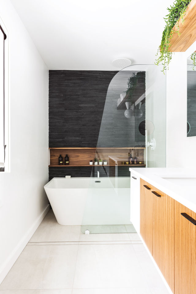
Image: Christopher Dibble
White walls and big open windows brightened the reading room, the library wall, the office. (“I’ve been reluctant, recently, to do everything in white,” says Horner. “But for this space it worked perfectly.”) The bathroom introduced blond woods, and a custom glass pane shower.
Of course, too much of one thing can be overkill. So instead of sticking with light and white with flecks of lime, the very center of the house—the former dining room—became a cozy, dark lounge. Horner painted the walls a dark forest green, almost black, and added a vintage chaise for reading. The room is a striking departure, throwing the otherwise uniform design off its axis, and introducing a wildly different mood to the central hub.
The dark hub, the bright rooms and blond woods, the carefully placed art, the streak of wild green—what might we call this aesthetic? Horner attributes the home’s final look to the owners’ heritage.
“There is this sort of European approach to home spaces that just isn’t quite the same in the US,” says Horner, who himself hails from England. “As forward-thinking, and as modern, and as contemporary as people can be here, design takes a slightly different direction in Europe. The owners wanted to feel like they were in a house in the Netherlands or in London.”
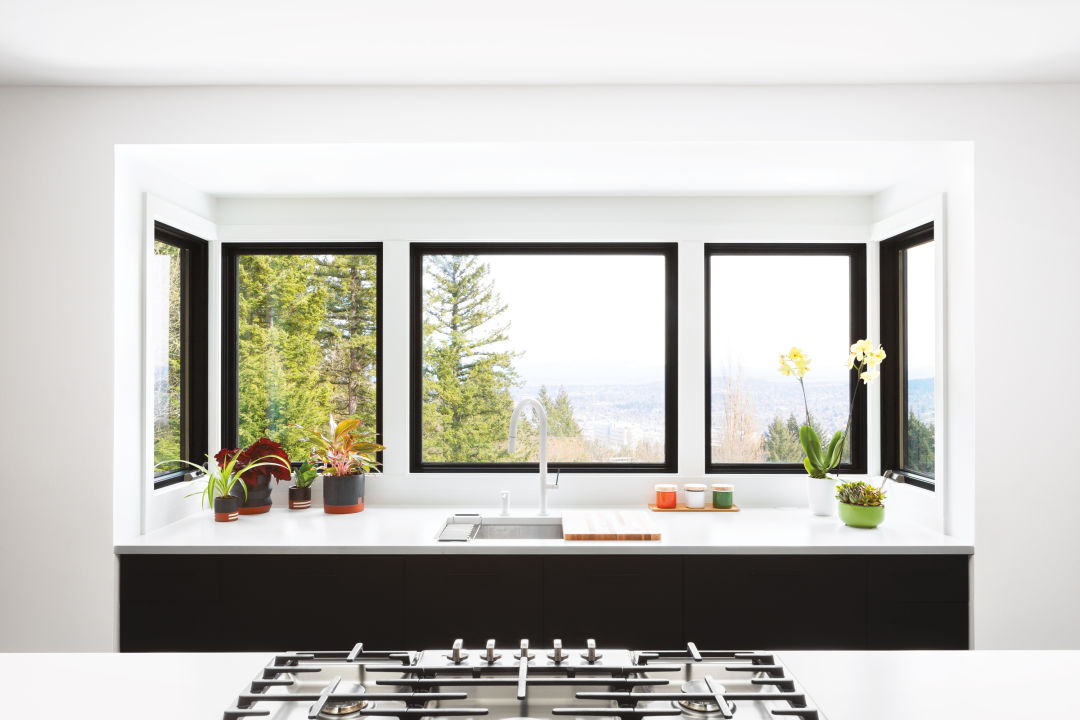
Image: Christopher Dibble
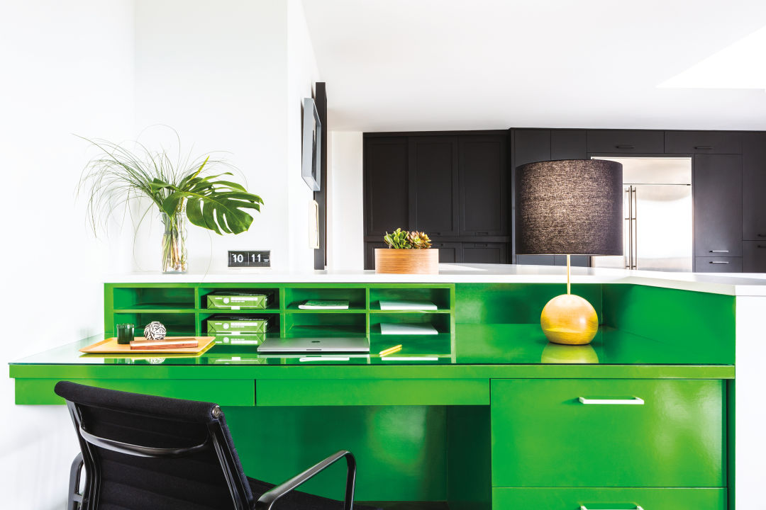
Image: Christopher Dibble
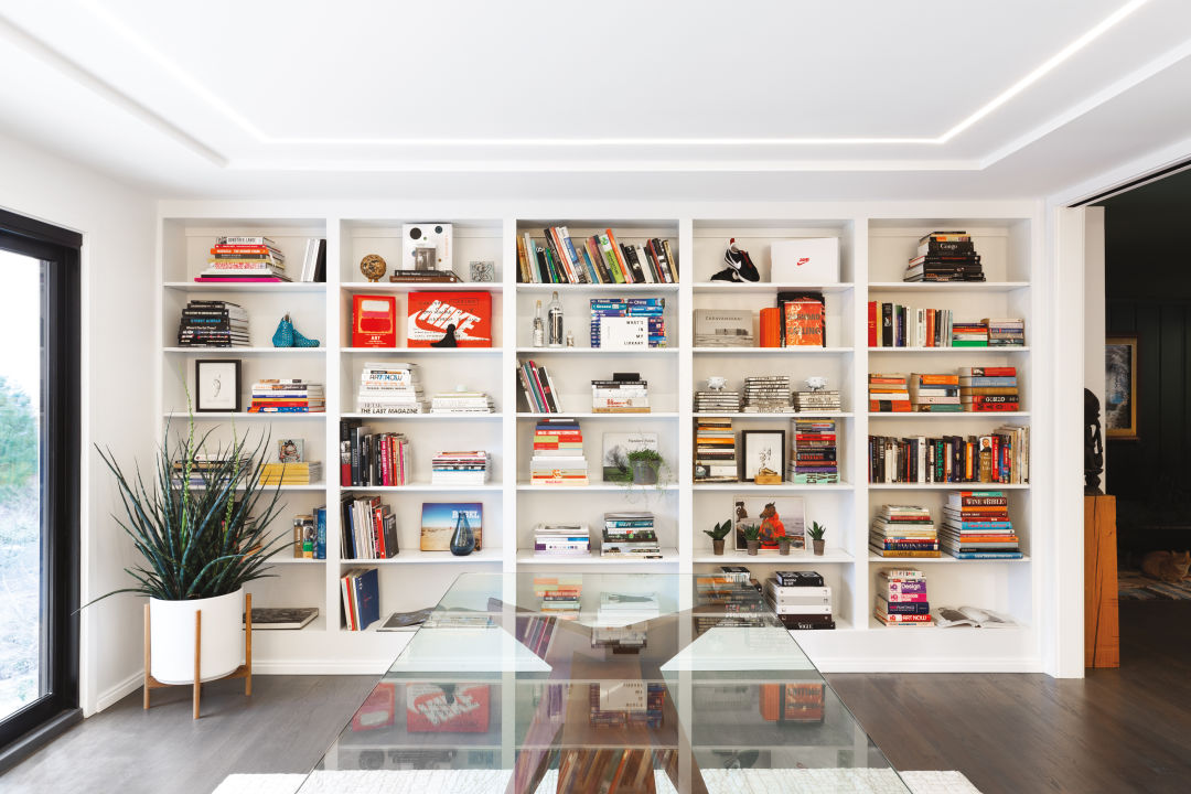
Image: Christopher Dibble
Image: Christopher Dibble
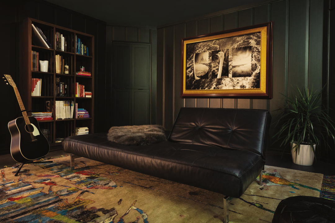
Image: Christopher Dibble