Welcome to the Redesign
When we started to redesign Portland Monthly, we didn’t plan to tackle the process in a stereotypically Portland way. And yet, in retrospect, we did just that.
We began with DIY enthusiasm—tempered, of course, by a healthy dose of overanalysis, a few passive-aggressive e-mails, and some fractured metaphors borrowed from home improvement. We weren’t going to just “slap a new coat of paint on it” or “rearrange the existing furniture.”
The city has changed a lot since Portland Monthly’s original logo was created in 2003. Media outlets, especially print magazines, have changed even more radically since our last major design update in 2007. So we dissected every page, debated what each item should be called (or did things need names at all?), and deliberated over how everything should be presented. To be honest, we got a little slap-happy here and there. Self-doubt struck more than a few times. But slowly, a plan started to come together.
Then it was time for that activity so beloved in a city where urban planning, knitting, and backyard homesteading are acceptable cocktail party fodder: we geeked out. Art directors Kate Madden and Michael Novak presented reams of type samples, introducing editors to foreign concepts like “x-height” and “H&J.” They valiantly argued for more white space. Days were lost to considering submillimeter differences in the gaps between columns. They presented options, week after week, for what this theoretical magazine might look like.
The final, scariest moment: when that theoretical magazine became an actual magazine. Deadlines were met (eventually). Compromises were made (mostly). Some navel-gazing was indulged. More analysis ensued.
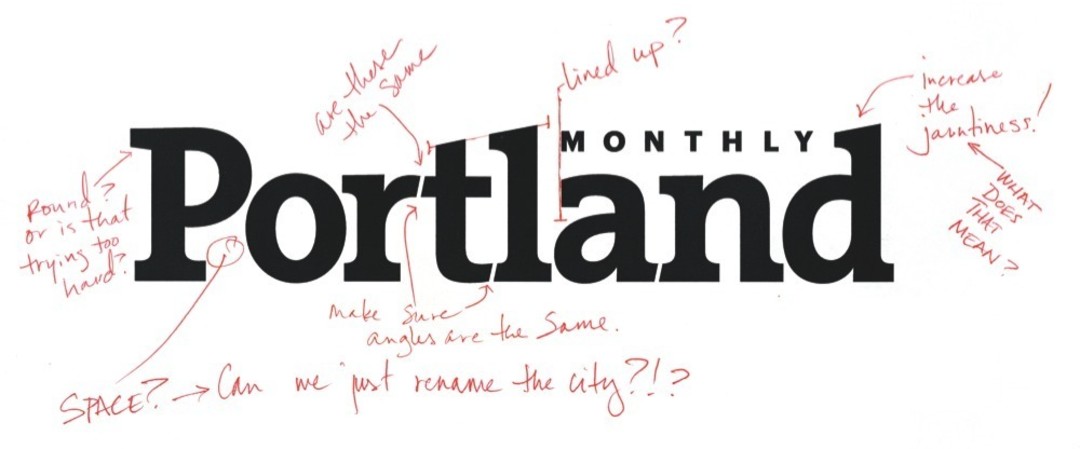
You can see some of the results on this very page. First, there’s that logo up above: a refined, sturdy take on a slab serif font that we think strikes a balance between Portland’s pioneer past and a future being shaped by both a handcraft revival and cutting-edge manufacturing. The shorter words are set in a typeface called Prumo, which makes for damned elegant headlines with its extreme ball terminals. (Ball terminals? They’re those pleasingly round ornaments at the end of y’s, a’s, and the like.)
The text you’re reading now [or that you would be reading, were this not the digital edition] is set in Mercury, a font created by the famed type-design firm Hoefler & Frere-Jones. It has a fascinating backstory (if you’re into that kind of thing), but we love it for its smooth readability. As for the actual stories, we restructured up front, where we distilled our Mudroom section to its lively essence and shifted longer stories on business and news to stand alongside our style, travel, and home coverage. Across the magazine, you’ll find that clean, airy white space the art directors fought for, along with a general rethinking of page composition.
Now we’re sending this magazine—which we’ve labored over for more than a year, which we’re deeply proud of, which we’re a little terrified to let go of—to press. The only thing left to say is what all Portlanders say when they expose their craft to the larger world: We made this for you. We like it. We hope you like it, too.