Oregon Food Bank Gets a Brand-New Logo and Look
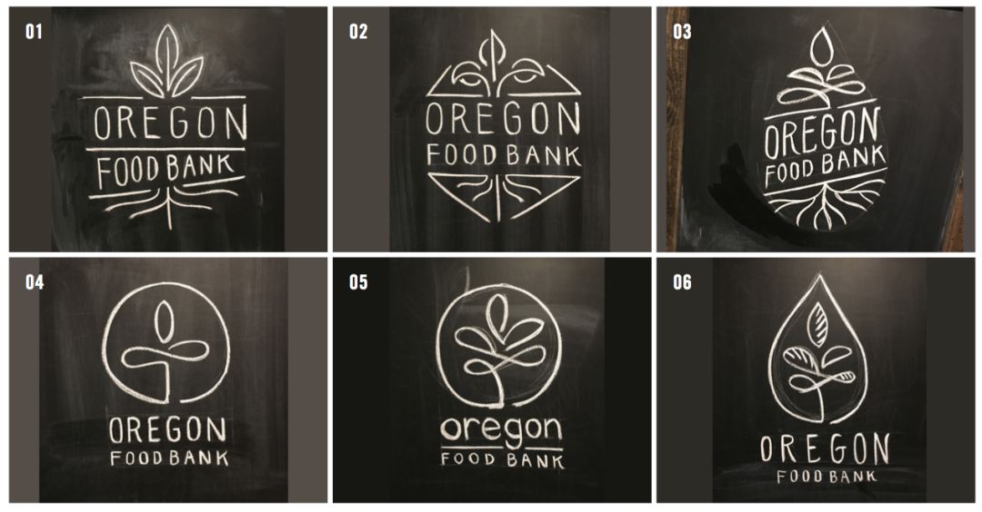
Industry's comps and brainstorming for the new Oregon Food Bank logo and identity.
Image: Industry
The 20-year-old Oregon Food Bank has a brand-new look.
In September, the social services nonprofit unveiled a rebranding that included a new website, complete with a reworked logo and chirpy color theme plastered on their statewide fleet of delivery trucks.
The logo features a green, sprouting plant, a symbol of the organization's commitment to delivering fresh food. OFB says it received 13 million pounds of fresh produce last year, and wants to de-emphasize a common food bank association with donations of predominantly canned and boxed goods.
Portland design firm Industry, along with apparel giant Nike, provided pro-bono creative work and consultation. Industry's co-founder Oved Valadez described the final product in an email: "It's humanity and optimism. It's authentic in the message, visuals, and logo. It's about getting the community to think beyond the can. To feed the human spirit."
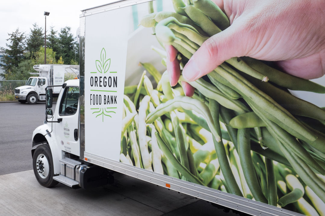
Image: Industry